 BACK TO ALL

Sometimes in our app we can’t predict where text will be placed on the screen. For example - a user can create a text sticker and place it wherever they want with their photo as the background. This can potentially make the text unreadable, when placing a dark text on a dark background, or vice versa.
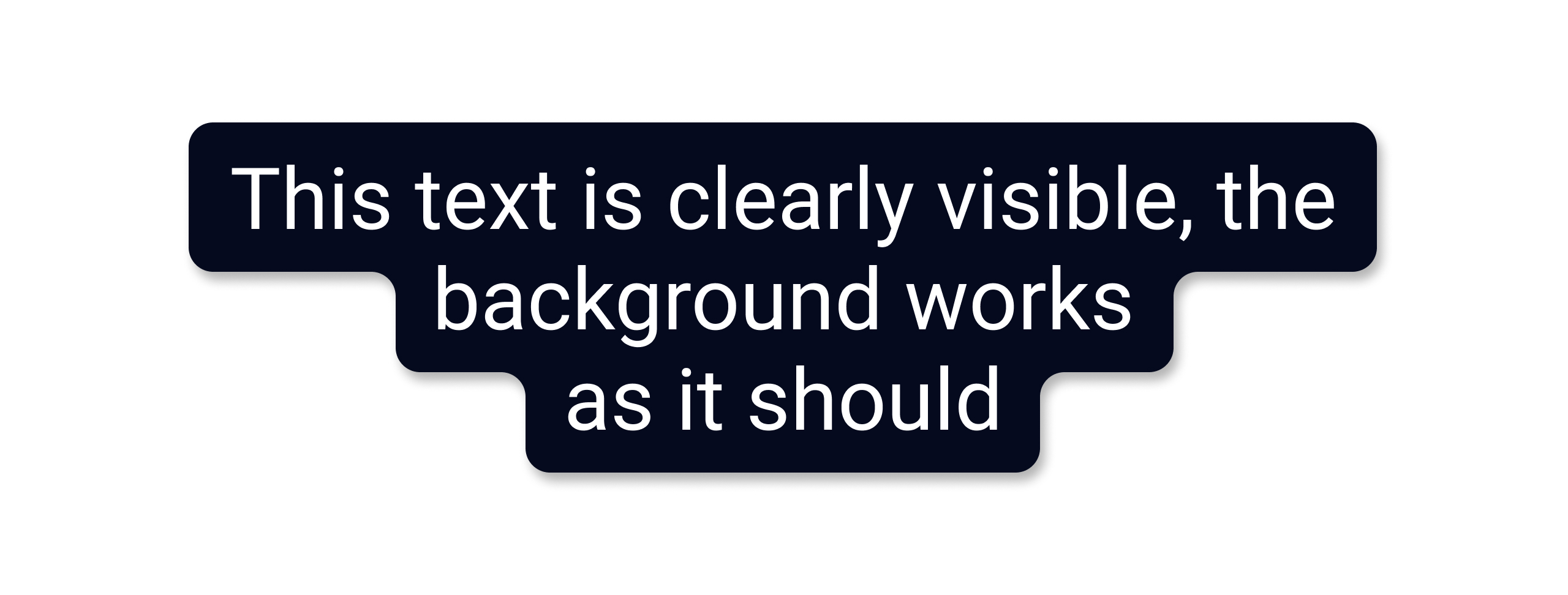
One of the possible solutions is always placing the text on a background. However, this background should not be jarring. Here is what we wanted to achieve:
Problem
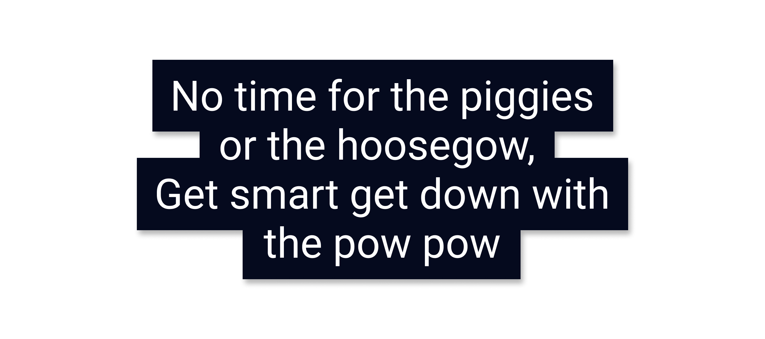
An obvious first choice is to use the standard background property. However, this will be the result:
 As you can see, with the standard means, the background on the second line of text is displayed with the full width of the element, the edges are not rounded.
Making variable width
How can we make the background of each line be drawn to the maximum width of the text? Let’s measure each line and draw a rectangle behind the text:
Note that the getLineLeft/getLineRight method should be used instead of getLineStart/getLineEnd because the latter gives an offset in characters, not in pixels.
Once we have measured each line, we create a common Path for all text:
Next we will create a custom ColorDrawable, and draw the shape there:
And now we can easily use the background:
For EditText elements we calculate the background not only when the layout changes, but also after text updates.
Here is what it looks like:
We will continue using this timeless wisdom by a famous philosopher and poet, Anthony Kiedis, as a sample text.
Smoothing out the sharp corners
One issue is fixed, but we still need to smooth out the sharp corners. If we start solving this problem head-on, the obvious way would be to draw Bézier curves for all the corners we need to smooth out:

In the example above, you would need to draw 6 rounded corners and connect them. To do this we can use:
Add a cubic Bézier from the last point, approaching the control points (x1,y1) and (x2,y2), and ending at (x3,y3).

Add a line from the last point to the specified point (x,y)
This approach draws line by line, so it’s necessary to remember the prior parameters of the figure in order to calculate the latter ones. The implementation turned out to be rather difficult to understand, although it did work.
An alternative approach
How can we make this more comprehensive? Ideally the sharp corners would be smoothed out automatically. Turns out there is a specific property which does just this and encapsulates all of the math - the Paint class has a property pathEffect that can be set to CornerPathEffect, which will draw the smoothed corners.
As always, it pays off to read the documentation before implementing something complex, since it was most likely written by another developer before you. However, the cumbersome approach is useful for understanding what happens inside the library implementation, and can be tweaked if you desire a specific smoothing effect that native options don’t cover.
Final API
We describe a simple API for using the element - there’s a way to provide a background color, shadow parameters, padding values and the rounded corner radius.
Instead of using a solid backgroundColor, you can use a gradient by specifying:
What about Compose?
After implementing this element using Android View, we decided to compare it to a Jetpack Compose implementation. Would it be beneficial to use the newer framework?
Turns out, there is almost no difference. In Compose, AndroidPaint is used instead of Paint, and you can also call the function:
This function will draw on the old canvas and reuse as much of the old drawing logic as possible. There is only one state we need to take care of - TextLayoutResult. We will use its persisted value when defining the decorationBox, which is a composable lambda for adding decorations around the text field, such as icon, placeholder, helper messages or similar.
This is how you can use it in your code:
As with the Android View version, you can specify a gradient instead of a solid background color.
Conclusion
The implementations shown here can help you create a custom shape background for a text in your Android apps. It should be a good basis for a more customized version should you need one. The repo contains both Android View and Jetpack Compose implementations as standalone libraries. The interesting parts of the implementation were discussed in this short tutorial, which will be the first in a series of Android View and Jetpack Compose tutorials we will publish in our blog. We also post iOS tutorials and libraries written in SwiftUI.