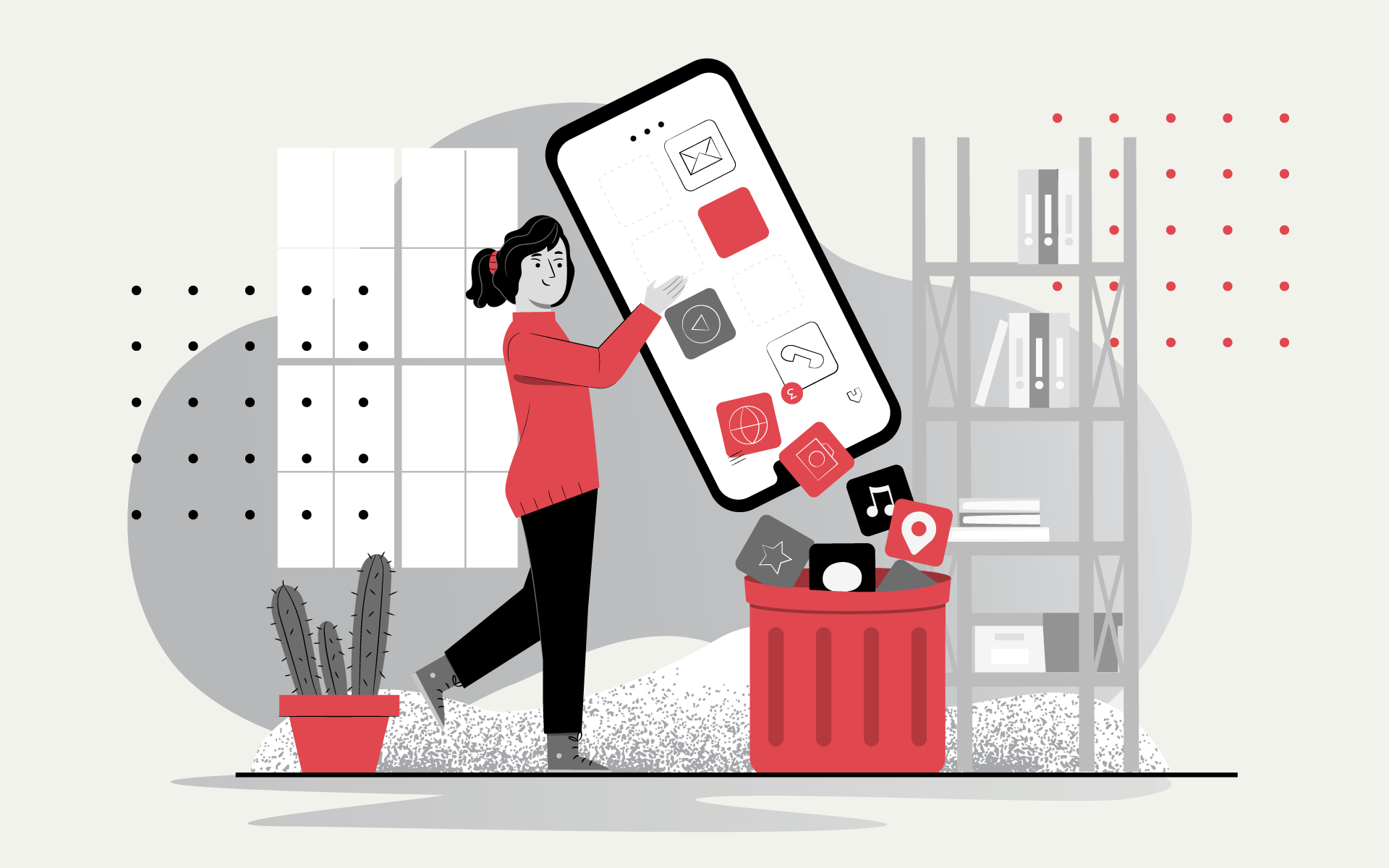
According to Appsflyer, 28% of apps fail to pass the 30-day mark after download. That is, every 3 apps out of 10 will be deleted within 30 days of downloading. That doesn't sound very encouraging, does it?
It turns out that a large number of installations is no guarantee of success. What if users delete your app in the first month? The reason for uninstallation can be trivial — the app is not suitable for the user's problem, or it can be more profound - annoying notifications, too much animation, a complicated interface, lack of navigation, and many other complications for the user. The entire app design can be divided into two parts: UI and UX. You should clearly understand their differences: UI (User Interface) is the appearance of certain elements, such as button sizes, fonts, colors, shapes, etc.
UX (User Experience) is the overall impression a user has of a product during and after interaction with an app. Look at the most successful apps — they solve our problems, are easy to use, and look great at the same time. That is what you should strive for: your app should combine great UX and UI without losing sight of the purpose for which it was created. To put it simply, when creating a product with a nice design, you can't forget about its users and their needs. Before the release, it would not be superfluous to check the project for popular UX-design mistakes. Our checklist will help you.
Mistake #1: An unpleasant first impression
This is probably the most important mistake. After all, if a user didn't like interacting with your product the first time, they are unlikely to want to do it again. Perhaps they will not even give you a second chance - the market is full of your competitors. Creating an app that's immediately intuitive and quickly gets the users to know the most interesting features is a delicate balance that is very important to a project's success.
Mistake #2: Apps without a purpose
 Take another look at the impressive statistics of app deletions and think about it. You should always remember why you are creating the app and what user problem it solves. A well-designed interface should help the user reach the desired goal as early as possible, with as few taps as possible.
Your idea should be understood by the user at the first interaction. Otherwise, it is likely to become one of the three that don't pass the 30-day mark.
Take another look at the impressive statistics of app deletions and think about it. You should always remember why you are creating the app and what user problem it solves. A well-designed interface should help the user reach the desired goal as early as possible, with as few taps as possible.
Your idea should be understood by the user at the first interaction. Otherwise, it is likely to become one of the three that don't pass the 30-day mark.
Mistake #3: design inclusivity
A common mistake, especially when it comes to apps that are used by a large number of people, is forgetting about design inclusivity. App design should be accessible to every user, regardless of age or ability.
Mistake #4: Not knowing your user
Before you start designing your app, you need to know your user. You can't make an interface for yourself, with the belief that "I'm part of the target audience, too." Because when we design an interface, we solve several problems at once:
- interface usage;
- business tasks. This is why it is important to think not only in terms of the business but also as an ordinary user for whom this product is created.
Mistake #5: Ignoring the budget
It is important to plan your budget before you even begin development. It will save you from wasting time developing UX templates that you will ultimately never implement if the team doesn't have the resources for it.
Mistake #6: Abusing push notifications
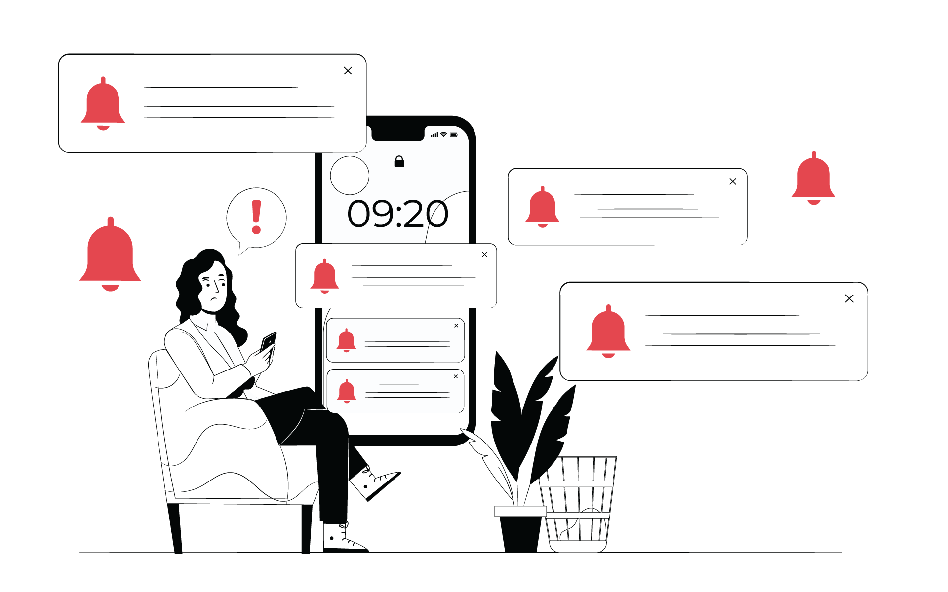 Push notifications are micro-interactions between the user and your app. On the one hand, they are a real boon. You can send the user necessary information and advertising, and it is more likely to be read than a newsletter. But there are also risks: the frequency and content of messages matter. For example, reminders, system updates or new functionality are important notifications.
Boring frequent intrusive content and aggressive marketing will most likely annoy the user and make them disable notifications, meaning you won't have the opportunity to deliver something important if you need to. So always make decisions in a balanced way by putting yourself in the user's shoes - would you benefit from this notification?
Mistake #7: Overcomplicated app design
Problems with navigation, rewarding blocks and excessive content can all be confusing. The user comes to you to solve their problem, not to appreciate all the design trends. Keeping it simple is one of the hardest things to do.
Mistake #8: Android and Apple are not the same
There is a misconception that the interface from one platform can easily be adapted for the other. It is not entirely true. Yes, of course, the elements and the overall concept should be recognizable to the user on either platform, but there are nuances.
Mistake #9: Ignoring the UX-structure of the app
A common UX mistake is to give much more importance to the aesthetics of an app than to the structure. If you put beauty before logic or navigation in an app, you will end up with a beautiful product that no one will want to use because it is awkward. Draw a detailed diagram of the app before you worry about font size or color scheme.
Mistake #10: Abusing animation
Animation is a great way to ease getting to know the product and bring the interaction to life. Unfortunately, overuse of animation negatively affects the user experience — it is simply annoying if it is pouring out of all the crevices on the user. Designers should pay attention to the micro-animations of interface elements. They are barely perceptible to the human eye but affect the perception of the interface as a whole and help the user understand that the system responds to their actions.
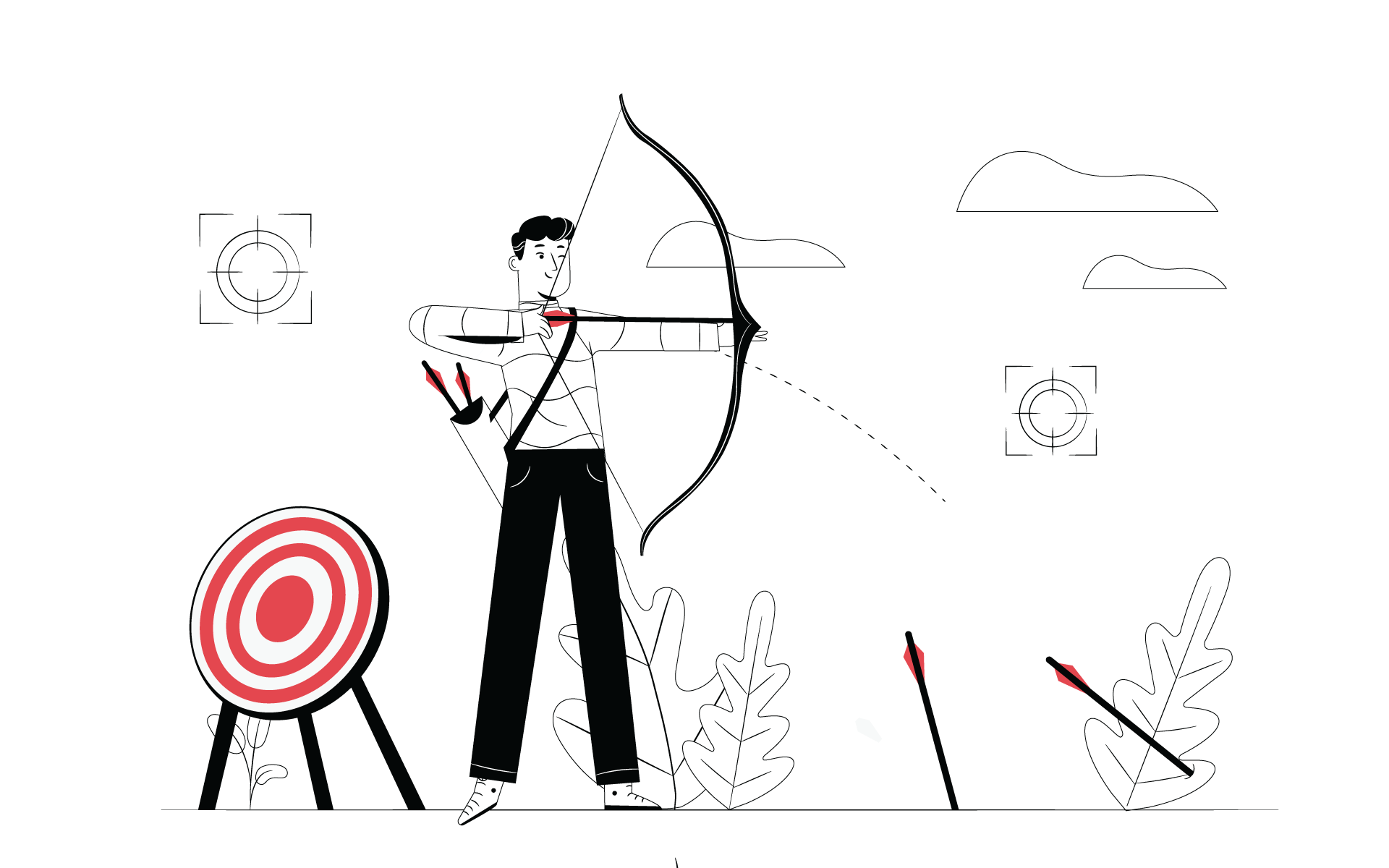
Mistake #11: Unclear UX priorities
Decide which UI elements you want to highlight and make them more prominent than the others. It will help users easily navigate your app and take targeted actions.
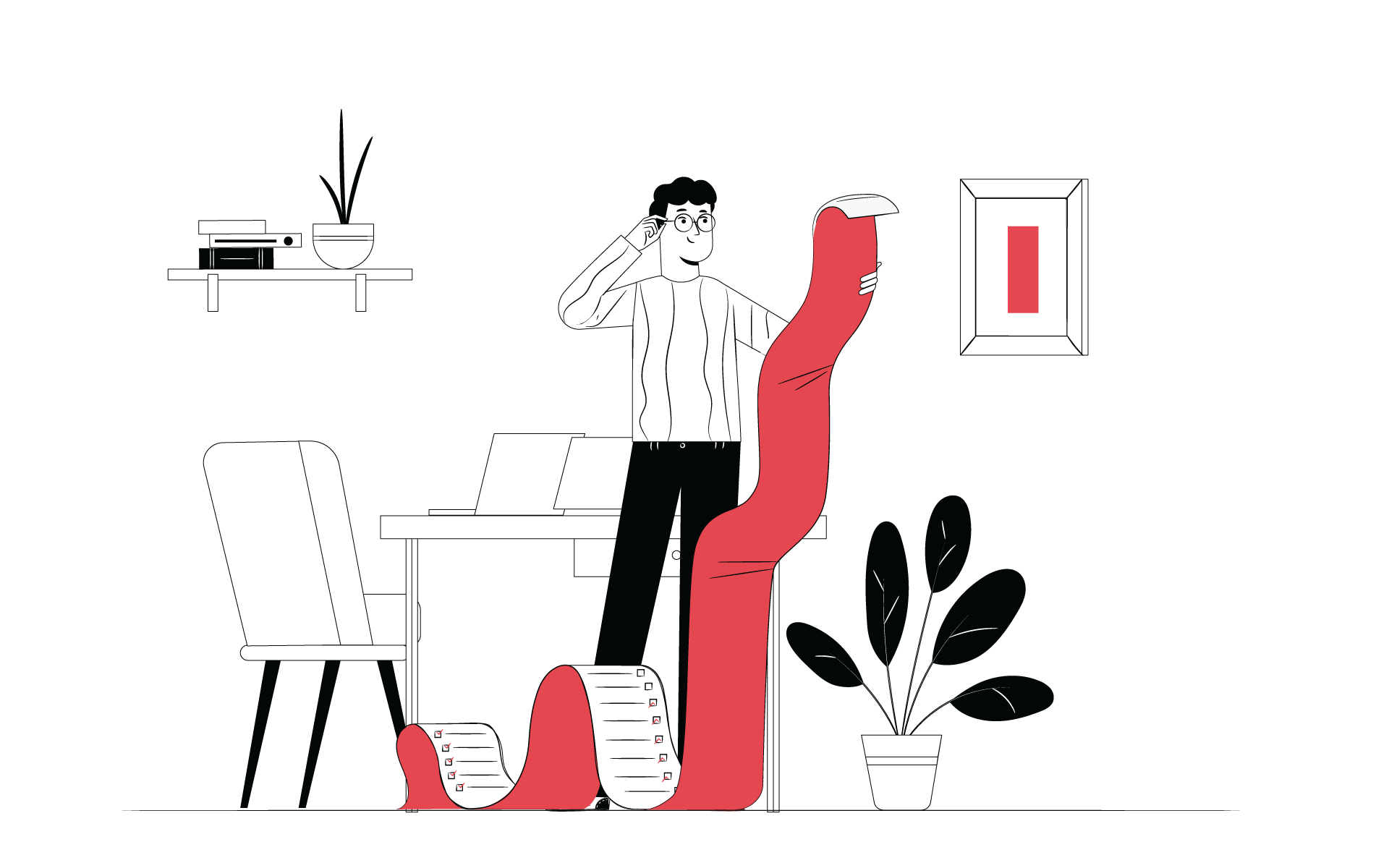
Mistake #12: Over-emphasizing features and functions
We're all very tired of overabundance - apps on the market, promotional emails, content. How we all wish we could just download the app and do what you downloaded it for. No confusion and ornate mazes of features. Complicated UI and UX design are some of the main reasons why people delete an app. It is important to think of the UI not from the developer's point of view but from the user's point of view.
Try to find the fine line between the user's needs and the number of possible features of the app and do not cross it. To understand what features the user needs, you need a clear vision and understanding of the product's end goal. Combining key features in this way will simplify the app experience, improve the user experience, and give your app a significant edge over the competition.
Mistake #13 Too much text
 Let's be honest, we don't download apps for content. Unless we are talking about a book reader app. Content is a nice bonus, an opportunity (not a necessary decision) for the user to learn something useful related to the purpose of their use of your app. So, don't overuse it: too much text on one screen is unpleasant and unattractive. But, if it is balanced with the necessary spacing and images, it is a different, pleasant story. The text should make an app appealing, not repel with its presence.
Mistake #14: Ignoring user feedback
Users are the ones who decide the fate of your app. And they should definitely be listened to. After all, they are the ones you are building the app for. If you ignore the feedback collected during beta-testing and while in use, if you don't understand their pains and are unwilling to fix the shortcomings — be prepared that your product will be quickly replaced.
Developing an app is a complex and time-consuming process. We hope that our checklist will help your product succeed and avoid the expense of fixing mistakes. It is always better not to make mistakes than to spend budget and time fixing them later. If you need help with your app, we can help you. Make an appointment for a free consultation with our CEO to discuss your problem.