 BACK TO ALL
One of the best ways to learn SwiftUI (same as most technologies) is to implement something useful and small, yet complete. A custom popup is a great choice — it’s one of the omnipresent UI tools that can come in handy when a native alert doesn’t provide the flexibility or feel you are looking for.
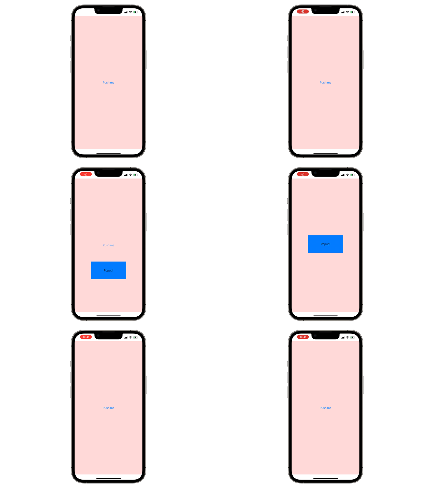
This tutorial will cover creating a minimal, but functional SwiftUI popup example from scratch. In the end you’ll have a working UI component you can embed into your SwiftUI app, or continue customising and improving. It will be a simplified version of the one available in our library. Here is what it will look like:
Defining the API
First let’s decide on the functionality of a popup we want to implement — it will be a view that is shown upon tapping a button. It contains a singular label and will animate its presentation and dismissal.
We will begin by writing an example of using this popup, and actually implement it after. This effectively defines the API we are trying to achieve, and helps us test as we iteratively implement the popup logic (not very useful given the simplicity of the article, but a good approach for longer projects).
We need to be able to define the popup appearance and style, add it to a view and control its presented state.
Here’s what this simple example does:
1) The @State var showingPopup variable will control the displaying of the popup.
2) The only button on the screen will change the showingPopup variable state.
3) We add the popup as a modifier of our view, passing a binding for the showingPopup to control the state inside the popup implementation.
4) The design and content of the popup are also passed as a parameter.
We will not consider the differences in SwiftUI vs UIKit usage, and instead just decide we want to use it in SwiftUI apps only. This lets us define it as a ViewModifier.
Now that we have an idea of how we want to call the popup and how it should look, let us start with the actual implementation.
Implementing the ViewModifier
This piece of code is pretty self-explanatory - it’s the definition of the popup modifier for View. We already know that we need two parameters — isPresented, which is a SwiftUI Binding property wrapper type for controlling the state of the popup, and view, that will define the presentation of the popup.
Now we can start with the most interesting part.
Implementing the popup view
The initialiser and public properties are straightforward - they were already defined and explained when we were choosing the API for the popup:
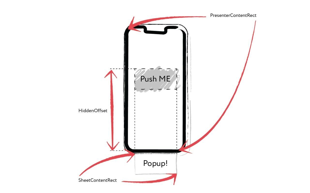
The list of private properties will give us more insight into the implementation details. The popup will be displayed or hidden simply by changing the offset of the view that contains it. It’s easy to calculate, gives us control over animation and works for all screen sizes.
Private properties will contain the frame data necessary for showing and hiding the popup - rects for hosting controller and the popup’s content, offsets for the hidden and shown state, and helpers for getting the screen size.
The actual UI content of the popup is minimal - we read the frame of the main content, then add an overlay sheet that contains the popup view. The sheet view in turn does mainly the same thing - reads the frame data of its parent to position the visible UI of the popup, as well as adding a handler for dismissing the presented popup on tap and a simple animation. You can also see the previously calculated currentOffset being used:
In SwiftUI animations can be as simple as adding a one-line modifier, as we do in the end of building the sheet view. Of course, you can instead animate it in any way you want - in fact, changing the position and the animation of the popup could be enough to make another type of a UI element (for example, a toast).
You may have noticed the frameGetter modifier. It is a cumbersome, but necessary way to get the frame in SwiftUI, which unfortunately isn’t available as a simple native call judging by SwiftUI documentation. Let’s hope there will be a cleaner way in the future:
In SwiftUI GeometryReader is a view that provides info about its size and coordinate space to its content. This is precisely what we need to extract the frame data.
Conclusion
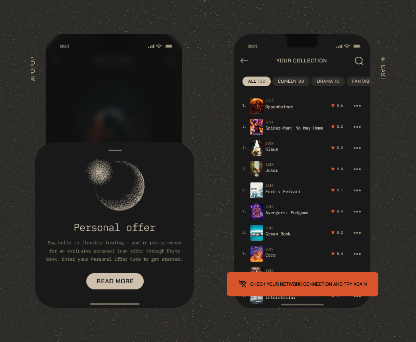
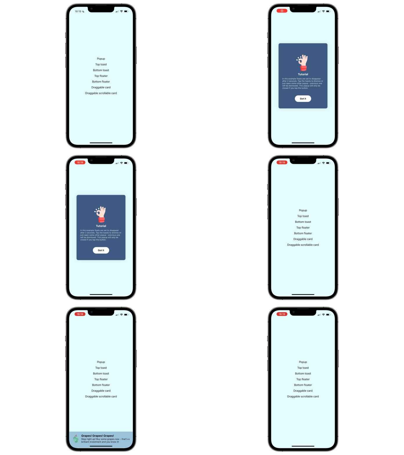
The code above is all we need to run a simple version of the popup view, and most of it is easy to follow and rather clean. This should be a good foundation for a custom popup element, if you require something more complex. You can also check out the popup library we implemented. In fact, the snippets from the tutorial are a simplified version of what you will find in our repo. The actual code is of course a bit more complex, but that is due to many added styles of popups, extended parameters and callbacks, and multiplatform support. The logic for displaying all of them is identical or very close to what we just implemented above. It can handle both simple popup designs:
As well as more custom types of popup screens:
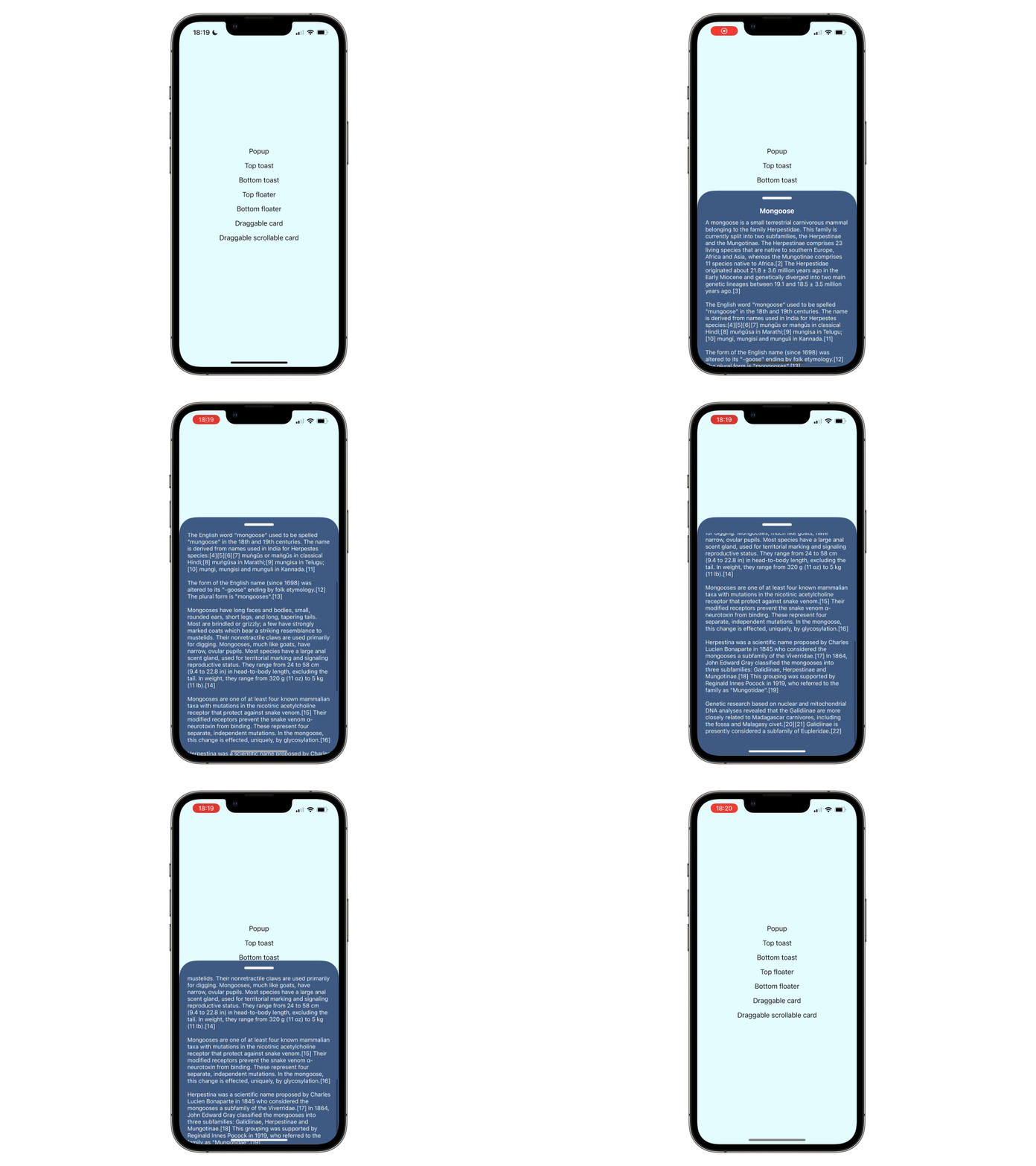
This article is one of many SwiftUI tutorials you can find in our blog. We cover replicating complex UIKit screens and tutorials on how we implemented our open source SwiftUI libraries (such as this one).


