 BACK TO ALL

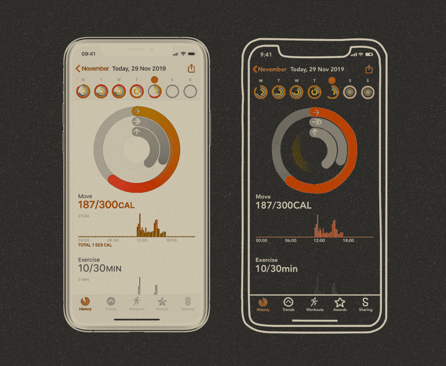
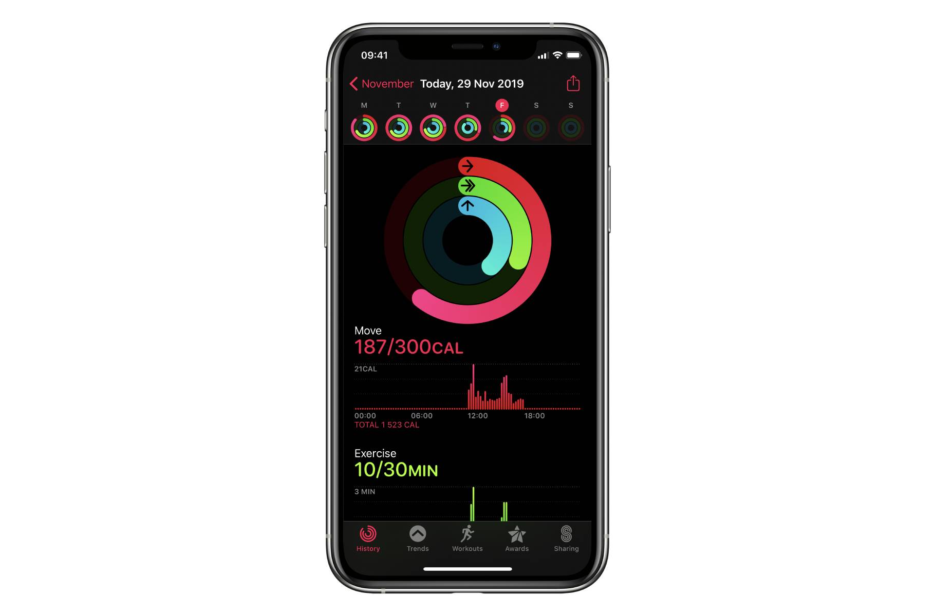
We’re back with a new SwiftUI tutorial, continuing our series on replicating complex UI screens - this time with another application from Apple’s, the activity tracker. At the time of writing SwiftUI is by no means finished or mature yet, but you still can create good looking custom screens, and we are going to show you how. So without further ado, here’s how to replicate this screen from Apple:

Screen Structure
For ease of reading, we shall divide the UI into 3 parts by their function, and explain each part separately. We will also add a simplified navigation bar with week days for aesthetic purposes. Its implementation won’t be covered here, because it goes beyond the scope of the single screen tutorial. Here are the main parts of the screen’s UI:
- Activity Rings
- Graphs for each activity type (Move, Exercise and Stand)
- Additional info (like number of steps and flights of stairs climbed)
With this approach the code for the main content view will look self-explanatory:
`Let’s proceed with the interesting parts of this tutorial.
Implementing Activity Rings
Activity Rings consist of rings for Move, Exercise and Stand type activities. We used Sketch to get as close as possible to the color gradient of each ring. SwiftUI provides us with just the tool we need to implement it, as well as making it easier to animate it later - AngularGradient:
RingView
Each RingView will be a ZStack that hold the following views and shapes - Background Shape, Ring Shape and Tip Shape (which is optional):

RingBackgroundShape
This shape describes the background shape of the ring and is a Path that holds an Arc with the desired thickness attribute:
RingShape
This shape will hold the path that displays the current completion percentage. We will add the contents of RingShape to a drawing group to take advantage of hardware acceleration with Metal:
RingTipShape
An auxiliary path shape that draws an ellipse in those cases, when the completion level is more than 100%:
Note:
Unfortunately we could not implement a good-looking shadow for the “tip” of the RingShape/RingTipShape and kept getting rendering problems, even thought it would be fairly straight-forward in UIKit. Please share your ideas of a pure SwiftUI implementation in the comments!
RingView Animation
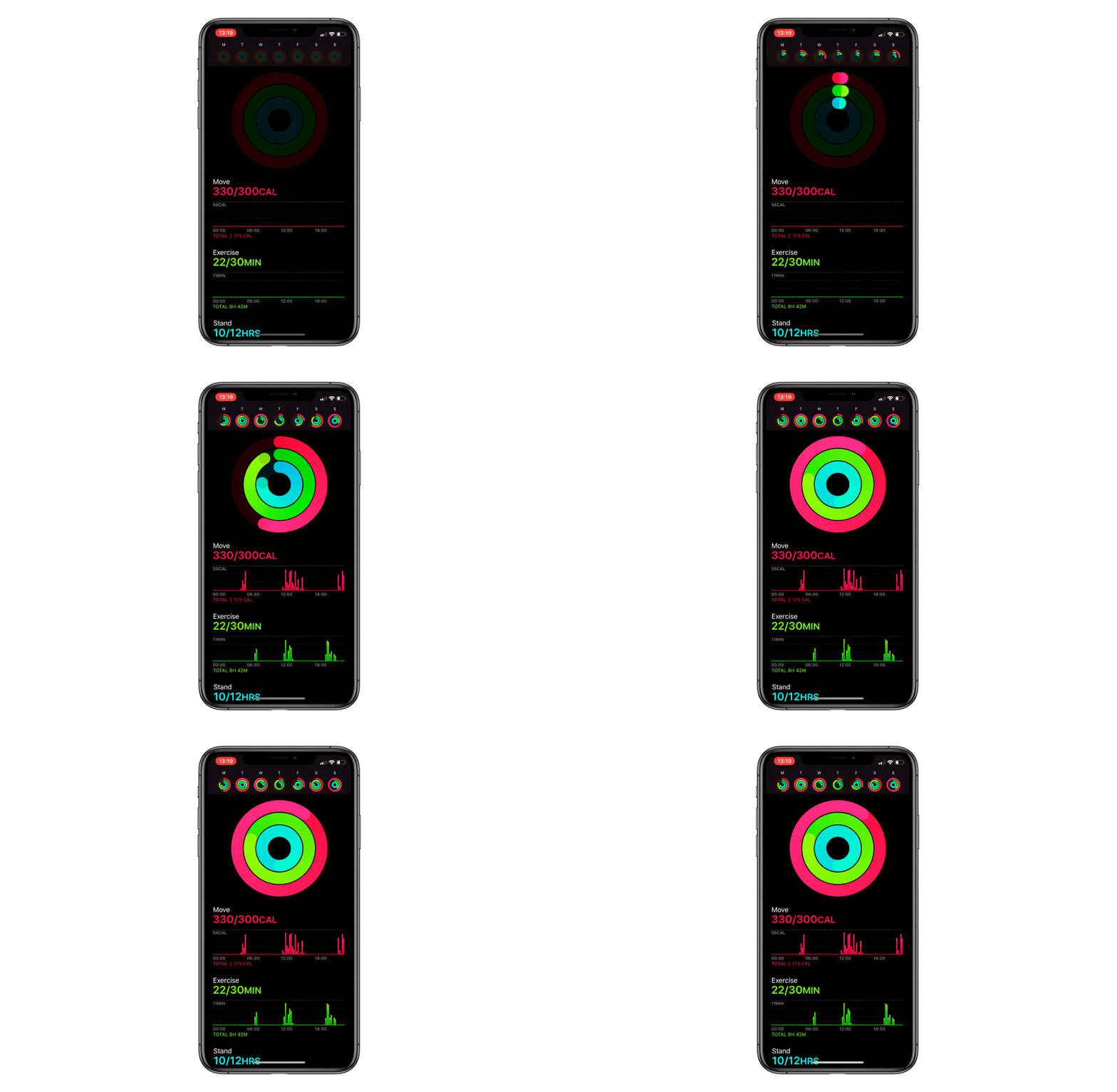
We will animate RingShape and RingTipShape by changing the value of the @State variable (we covered @State keyword in the previous article of the Replicating series, but it’s basically an annotation that denotes a changeable value that has to be updated in the UI). This variable will be called currentPercentage and defined inside the RingView. Let’s also describe the animation parameters for bringing it to life:
Using this variable, we start the newly described animation in the onAppear function of the RingShape and RingTipShape classes using the withAnimation block:
You might have noticed the animatableData in the RingShape and RingTipShape snippets. Thanks to the Animatable protocol and the @State annotation, any change to the currentPercentage value will automatically redraw the shape.
To have the animation be as smooth as possible, we want to use hardware acceleration. You can achieve this in SwiftUI by wrapping the RingShape in a Drawing Group. Hardware acceleration provides optimal performance and seamless animation on devices with high refresh rate. For further reading on the subject we recommend this article from Paul Hudson.
Here’s the full code for the RingView implementation:
Creating Activity Rings
With the RingView code ready, creating the rings is an easy task:
We also provide the RingView constructor with our colors that we defined in the Color extension beforehand, and stub values in the ActivityData struct.
Activity Graphs
Activity app uses 2 different graphs for its activity types - a usual bar chart for Exercise and Move types, and a custom graph for Stand type. Let’s take a closer look at the custom graph.

Graph’s Structure
Header
Each graph starts with adding a header that shows the title and the completion of the daily goal. We shall use a VStack that holds Text elements displaying stub data from the ActivityData struct. Text objects have an extensive API in SwiftUI, so we can get very close to the original design:
Our next step will be drawing a grid that acts as the graph background. We define the number and size of the grid bars in the Constants struct. Let’s use a Vstack that holds multiple HStacks to draw 4 lines with dots to act as the grid:
BarView and BarShape
BarShape is a rectangle with rounded corners. We are going to animate its height and position using animatableData that is associated with a @State variable called CurrentHeight (it will later be declared in the BarView). Note that it is the same mechanism we used in RingView:
Let’s user the rectangle’s height and 2 linear gradient colors ad input parameters for BarView. We will also describe the animation and its parameters that will change the @State variable currentHeight.
After that is done, we create a HStack of BarViews (we again use stubbed data from the ActivityData struct):
Legend
The legend shows time intervals for the graph and is simply an HStack with 4 text views, separated with spacers:
Footer
Footer is a styled Text that displays values from Activity Data.
Additional Info
We add some additional information about user activity to the very end of the screen. As usual, to create the layout we combine basic VStacks and HStacks, as well as spacers and dividers. Taking our time to reproduce the text appearance from the original application, we end up with the following code:
Blur View
Here’s a little bonus snippet a change of pace - implementing a blurred “frosted glass” background for the navbar. We know we said the navigation bar will be left out of this tutorial, but it turned out to be a good problem to introduce UIViewRepresentable. Say you can’t implement something in SwiftUI (like we couldn’t with the blurred navbar), or you have a control you don’t want to reimplement. In this case you can use the UIViewRepresentable - as the name suggests, it represents a UIView.
Using it is very simple. We create a UIVisualEffectView, and wrap it in a container view that we return. Now it can be used in SwiftUI:
Conclusion
As you can see, yet another pretty complex UI screen has been represented using SwiftUI in a succinct and easy to implement manner. Even though some things are hard or cumbersome to create, you can either wait until Apple adds it to SwiftUI (which is still in early stages of maturity), or use UIViewRepresentable - a protocol that bridges SwiftUI and UIKit.

We hope that this tutorial was helpful in getting a feel of how SwiftUI is used in custom UI development and plan to be back soon with another tutorial. If you have an idea for the next article in the series, please leave a comment with you suggestion!
The full project is available on GitHub.


