 BACK TO ALL

Apple’s new declarative interface build tool SwiftUI is changing a lot in each new release, but what’s available now is already a versatile and powerful system. And while simple UI forms are straight-forward to implement, some of the more complex screens can require quite a bit of work, especially given the somewhat limited API documentation and lack of examples.
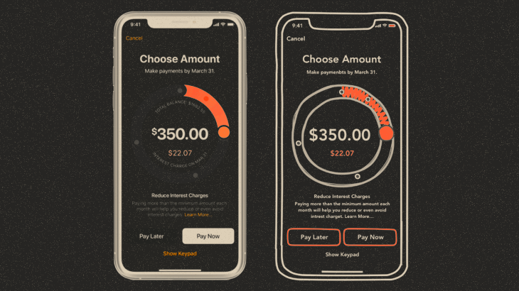
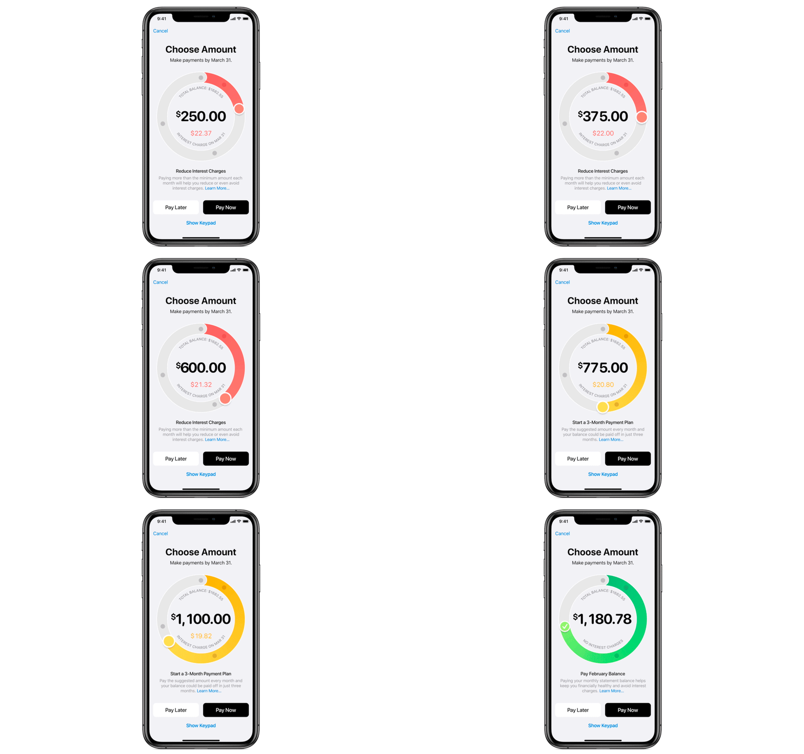
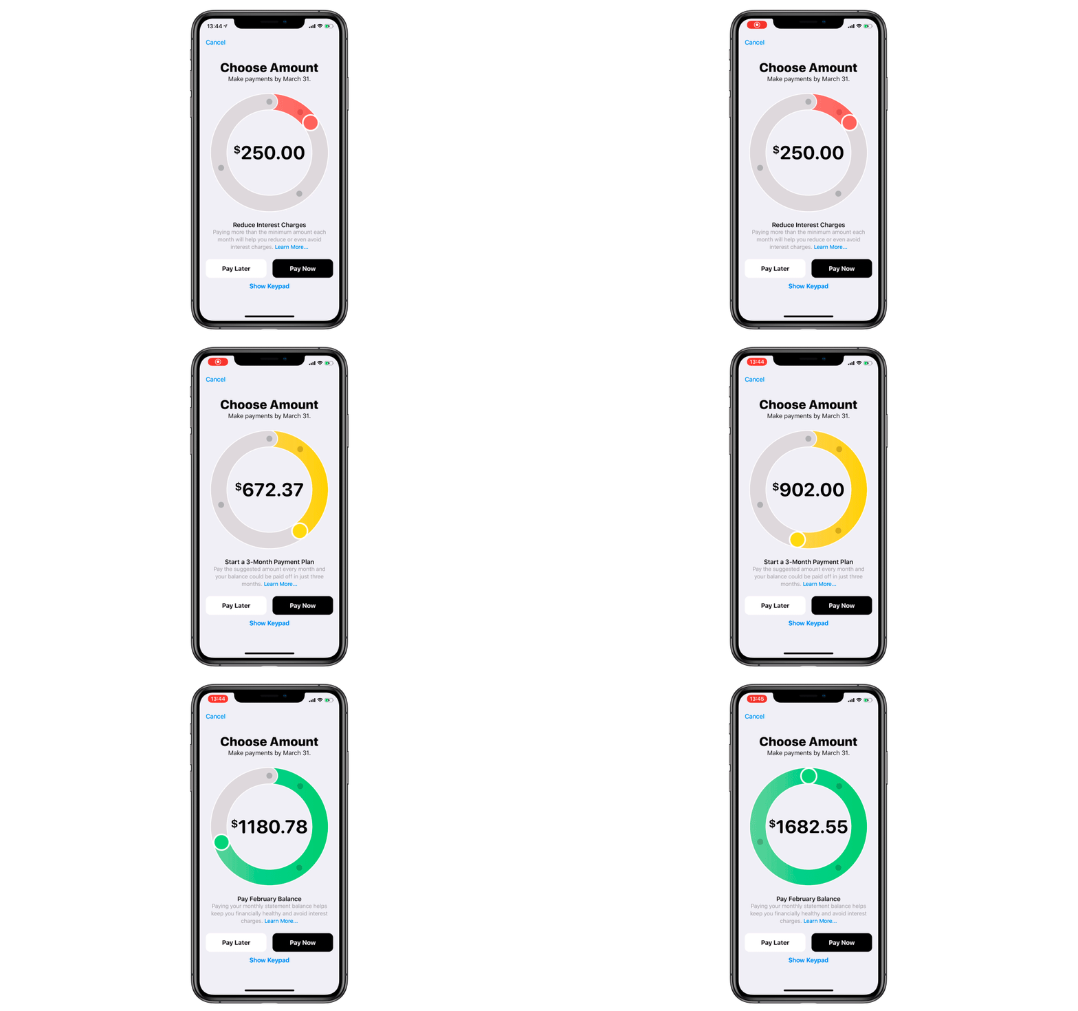
So, continuing our tutorial series of replicating complex UI screens, here’s how to implement one of the screens in one of Apple’s application - Apple Card.

Disclaimer about this SwiftUI tutorial
We had a fair bit of problems while creating this tutorial for a number of reasons:
- SwiftUI still in beta with the official release coming soon.
- Our developer had problems with using preview canvas in Xcode - it was crashing even after he updated to the latest Xcode and OS versions.
- We have limited access to the app in our region, so we had to rely on public videos and animations (please excuse any discrepancies).
- Same goes for the design - insets, background colors, fonts etc. had to be chosen by eye. However, it doesn’t affect the SwiftUI parts of this tutorial.
- We could not find a way to create the curved text (the one following a circular path) using pure SwiftUI. If you know a way to do it, please let us know in the comments.
So, let's begin. We’ve separated the code into snippets by functionality, and will do our best to highlight the interesting parts.
UI Stubs
For our screen, we need to implement basic things:
SwiftUI Navigation view
Body:
Labels:
We added top labels as titles for simplicity, the same reason we use static values for them.
Thankfully, the code for adding buttons is self-explanatory:
Preparing data for Circle Control
Let's move on to Circle Control:
Our circle control will receive data for calculating the values and displaying them to users. We will call this data object “Segment”.
We then create an object of the newly declared type to represent the currently selected segment.
We want the bottom descriptions to depend on the selected segment from the circle control, so we add the @State attribute. Simply put, the @State annotation denotes a changeable value that has to be updated in the UI. Here’s Apple’s documentation entry about it. We use this @State variable in the following block of code to set the values:
The following properties are also necessary for CircleControl: total balance, current value and the knowledge of the currently selected segment.
The selected segment is denoted with the @Binding annotation, which basically says that it comes from outside the view domain. After that, the code for control creation will look something like this:
Circle Control UI
Here’s the body initialization code:
As you can see, the bulk of the UI is implemented using circles and arcs. Let’s look closer at 3 similar methods - createProgressArc, createPoint and createControlPoint. Also, we shall define some auxiliary methods:
- for finding current segment
- for finding nearest segment point (for the snapping effect)
For the progress arc, value points and the control point methods we need to calculate the correct angle on the circle. The value of this angle is the position divided by the totalBalance, multiplied by 2 * pi.

And for translating this angle to the top position of the circle, we should reduce the value by pi /2.
angle = valuePosition / totalBalance * 2 * .pi - .pi / 2
Finally, we need to calculate the x and y points for the location.
The most important part of this control is the movement control point, and we want it to animate smoothly. The control point itself is simple view, but with an added drag gesture (similar to UIPanGestureRecognizer). This is how we add it:

Calculating values for Circular Control
When we need to find the new value, we calculate it as the ratio of the new angle to 2 * pi * total balance, so here are the necessary steps:
- Get a vector from the drag location and the center of our circle (value of the center is the same as the radius in this case).
- Get the angle value.
- Apply a fix for negative angle values.
- Calculate the new value.
Implementing snapping to points
If during the control point movement we detect a segment point nearby (using some arbitrary coefficient), we “snap” to it - simply setting the value to the found segment point.
Otherwise we just change the value linearly, but make sure we stay within the maximum and minimum circle values.

Which’s great is since the current value is a @State variable, the UI will update automatically when the value is changed because it’s used for drawing the control point and the progress arc.

And there it is!
The final code is clean and easy to follow, but was not trivial to implement because of some new concepts SwiftUI presents.
Hopefully it’s useful to someone else who decides to create custom UI screens using SwiftUI. The full project is available on GitHub. If you'd like to work with us, drop us a line here.


