 BACK TO ALL
Sometimes you want your app to look as native as possible, and sometimes the design calls for a more lively UI. In this case one of the best tools in your disposal is animation, and anything can be animated - even the core UI elements, such as the tab bar. Of course, this means the tab bar has to be fully custom, and the animation itself might require some actual math. Implementing this in SwiftUI can be challenging, especially if you’re more used to implementing custom layouts and animations in UIKit. Here is our take on a tab bar in SwiftUI with a number of preset animations. As is usual at Exyte, here is a tutorial on how to implement it, to complement our growing collection of SwiftUI articles. This particular element has already been implemented for Android using Jetpack Compose, now it's time for the iOS version.
There is a lot of code to cover, so we will split the creation of this component into manageable steps, describing the SwiftUI approaches we will use and the math necessary for each step:
- Layouting the tab bar buttons to take equal space along the whole screen width. We will use the
Layoutprotocol and use aPreference Keytrick to store the frames. - Animating the ball along a path. We will use a ready solution to get coordinates along a Bezier path, and use
GeometryEffectwithAnimatableDatato implement it in SwiftUI. - Make a rectangle with a growing/shrinking indentation - by building a parameterized Bezier curve, using an animatable data parameter belonging to a SwiftUI
Shape. - Delay the animation of indentation to align it with the ball transition, using the same animatable parameter from the previous step.
- Make the icons lift up towards the ball when selected, and their content wiggle a little bit. Again we create a parameterized Bezier curve, and use separate animations for different movements.
So, let’s begin.
Step 1. Filling the bar with buttons
The math is quite simple here - we just need to calculate the available width, and then divide it equally between the buttons. In SwiftUI terms it can be done with a simple HStack with padding, but instead we opted for the Layout protocol as a more elegant solution. In this case the subviews are placed along one line, and we store their frames using a PreferenceKey for later use.
To use the Layout protocol we must override two methods: sizeThatFits and placeSubviews.
sizeThatFits lets you set the size for the new layout. In our case we want it to take as much space as is available horizontally, and be as high as the highest subview:
placeSubviews distributes subviews inside the size we claimed earlier: we start at the left edge and spread them evenly:
Then to store the coordinates for future use, here is the PreferenceKey:
Here is a stripped down version of the base code for the tab bar and its usage.
By this point the library can place buttons in a row, select a button while deselecting the previous one, and remember their positions in tabbar’s own coordinate system.
Step 2. Animating the ball
The math becomes more involved at this point. We need to create a bezier curve, and be able to get coordinates on this curve for any given “traversed” percent value. On the SwiftUI side we will use GeometryEffect with AnimatableData. They will make it possible to change the appearance of the views in small steps - for now we will change an offset over time using interpolation.
This effect takes a path and a parametrization parameter that changes from 0 to 1. Declaring t as its animatable data means a smooth interpolation - so the offset will also be updated smoothly. For any given value of t we need to get a relevant point along the path. Thankfully, an example is easily found with simple web searches, so that’s what we did - check out the BezierPathLength in the sources.
This effect also acts as a regular offset, determining the place of the ball on screen both during and after the animation. So there’s no need to set any more offsets/positions for the ball.
Here is a convenience modifier for this effect:
Now let’s create a path along which the animation happens. It’s going to be a simple curve from the coordinates of the previously selected tab to the newly selected one, with one control point a little above the two. Here we’ll need the coordinates we saved earlier and a way to store the previously selected index.
First, the path:
Then, a convenience method to get the necessary coordinates to pass it to the trajectory function:
And the last piece for this task - remembering the previous selection. It’s as easy as subscribing to the changes of selectedIndex:
Now we can create the required path like this:
The last step is to initiate the animation by changing the value of t from 0 to 1, which will then be interpolated by our GeometryEffect and will cause the offset to change. We use .onChange(of: selectedIndex) since this is the moment animation should start:
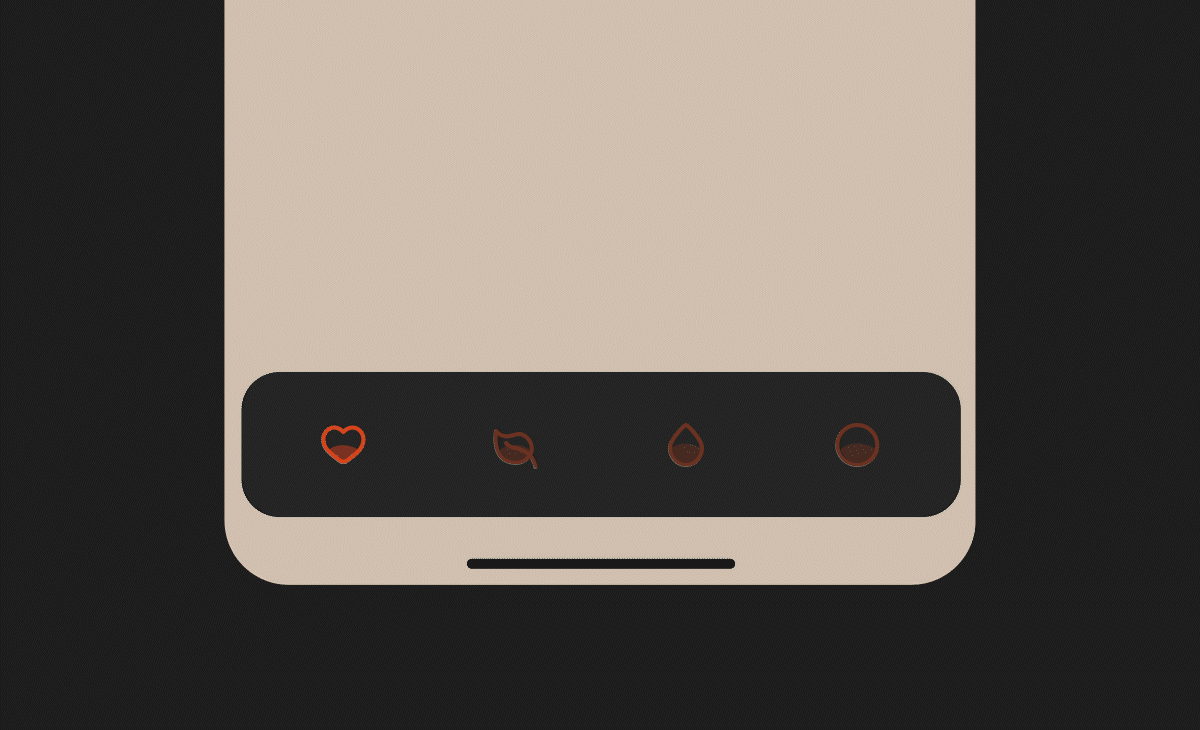
Here is the second draft of our tab bar, with an animating ball.
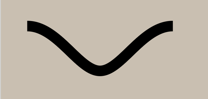
Step 3. The indented rect
Here we will create a Shape with an animatable data parameter t, which will be used to construct a parameterized bezier path for the desired indentation as part of the complete path for our Shape. We use animatableData once again, only with Shape this time, with the same result - a nice interpolation of t parameter to for an indentation:
This is an SVG path describing this line:
You can use a normalizing struct to draw this curve in any custom rectangle:
Then we declare 4 vertices of the rect, and connect them with each other and the indent we described earlier. We change the depth of the indent by interpolating from 0 to 15:
The width of the indent is constant, it’s situated in the middle of the top of our rect, and changing the parameter ‘t’ changes the depth of the indent. Then we simply connect the indent and the vertices to each other:
We use these rects as backgrounds for every tab, with t set to 1 if the index is selected:
Step 4. The delay
We would like the animation of the appearing indentation to start with a delay, and the animation of disappearing indent to run quickly. In our case, if the animation takes 1 second, then appearing happens from 0.7 to 1, and disappearing happens from 0 to 0.3. Nothing happens for the rest of the time. In terms of the parameter t used for parameterization, in case of the appearing animation:
- When
tis in the range from 0 to 0.7 we should act as if it’s still 0 - nothing should happen - When
tis in the range from 0.7 to 1 we should run the whole animation quickly. To make it smooth we need to normalize the parameter to change from 0 to 1. In other words: the parameter changes from 0 to 1 smoothly, but only during the 0.7->1 second timeframe.
Same goes for disappearing: starting with t = 1 we need the whole animation to happen during t 1 -> 0.7 and return zero for 0.7 -> 0. The interesting part is that this is achieved through exactly the same code:
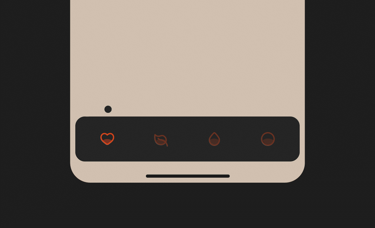
Step 5. The icon effects
To animate the insides of the tab icon we create one more shape, and create two separate animations running on different curves to move the icon and its inside shape independently. We will parametrize the bezier curves as we already did. To implement the desired animation the button needs to grow a bit, while its insides wiggle around. The interesting part is that they need to have different animation curves: growth will have a .linear curve, and wiggling - a .spring curve. Let’s start with the background, using the animatable data we already know how to implement.
An here is the whole button with the background we just implemented:
Here is the result for now:

We declare two animation parameters: for growing and for wiggling, and a scale parameter that depends on the former. After that we finally put it all together:
One thing left to fix is the initial selection. Before any tab has been selected and thus triggered onChange, t for all the buttons will be 0, which means none of the tabs appear selected. So we’ll have to manually account for this case:
Here is the usage:
Finally
As you can see, the underlying code for our custom tabbar is fairly simple, you just have to keep the details and edge cases in mind. We are happy with how it turned out, and hope the tutorial was useful for you. Meanwhile we'll continue creating tutorials for native mobile development - check out our iOS and Android articles!