 BACK TO ALL
This is the second article of the dribbble Replicating series. The previous post demonstrated implementing the dynamic width animated audio bar. This will focus on replicating the Action Panel.
Consider how the panel is designed. Let's see this panel with slow motion animations:

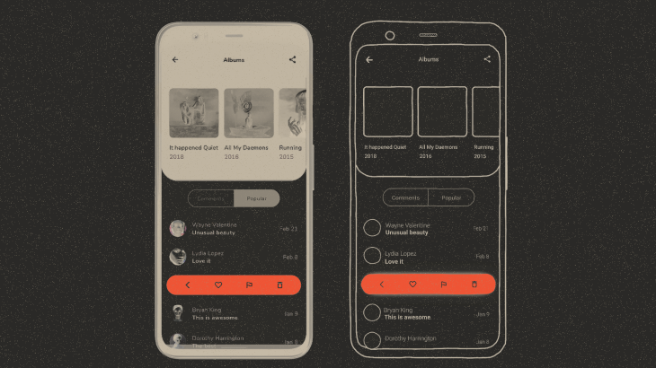
In each comment list item, we have two elements:
CommentListItemthat displays the comment information.ActionPanel, a small panel with comment action buttons inside. It rolls in over theCommentListItemwhen the user clicks on the comment.
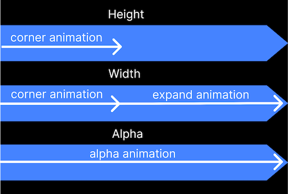
Let’s describe the bar appearance animation. Initially the height and width of the panel change evenly, let’s call this corner animation. After that we only animate the change of the width, we will call this the expanding animation. Meanwhile, the alpha component (the transparency of the view) is animated steadily throughout. Timeline for a better understanding:
To animate the change of the height and width we use the following code that sets up a transition, and then updates it with the target provided by targetState:
updateTransition(targetState = isVisible, label = "Visibility")
When targetState changes, the transition will run all of its child animations towards their target values specified for the new targetState. In case you haven’t worked with animations before, note that label is needed for Android Studio tooling to differentiate between animations.
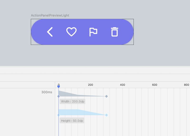
Let’s consider the expanding animation. We use transitionSpec to set the animation and specify animations for each pair of initialState and targetState. The keyframes parameter specifies animation phases based on the values of the snapshots set at different points in time during the animation. At any given time, the animation value will be interpolated between two keyframe values. In this case, the height animation starts with a certain speed for CORNER_DURATION, then continues at a different speed for EXPAND_DURATION. For in-depth information, you can consult the official documentation
The height animation also uses frames. When the action panel appears, its height reaches its maximum value. When the panel disappears, the height animation should not start until the corner animation has started.
The alpha value varies from 0 to 1. So we can use the proportion from the initial width to the maximum width of the panel.
This concludes implementing the Action Panel. Next installment in the series demonstrates implementing the Collapsing Header in more detail. See you there!