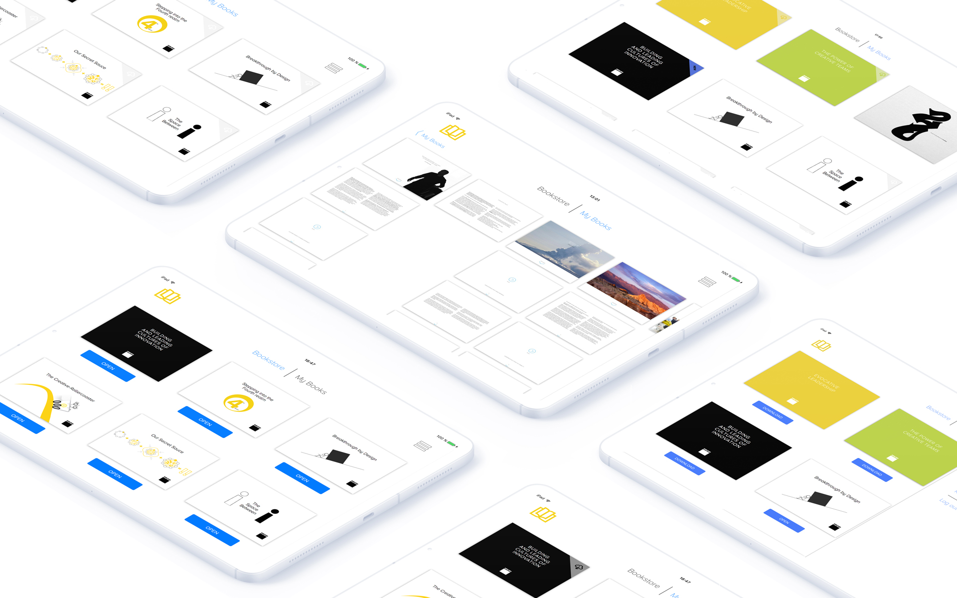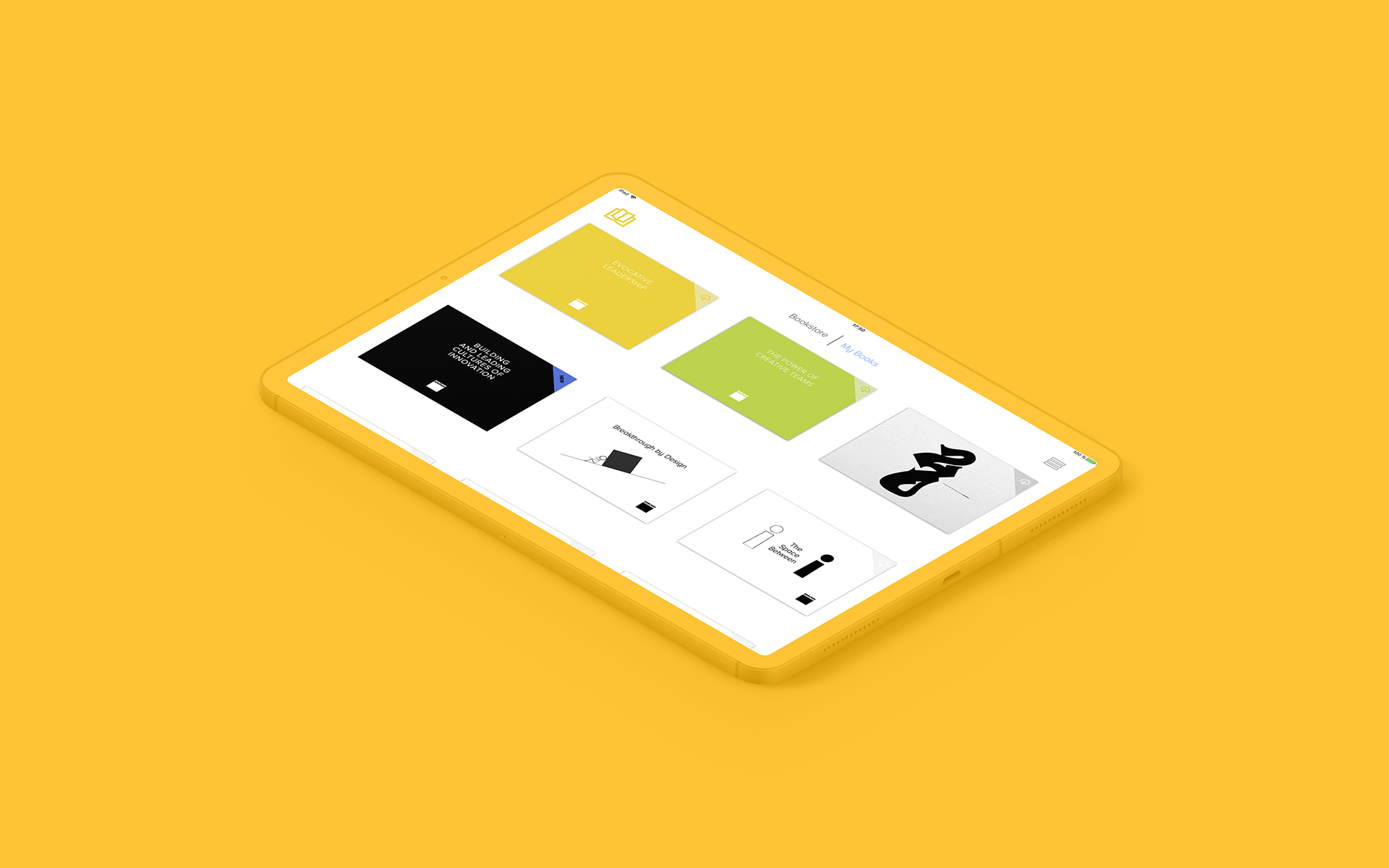

Since the 90’s Nowhere helps develop corporate culture by improving communication within a company and creating all conditions for a productive and creative working environment. Nowhere has published multiple books and brochures to help build and fine-tune efficient company procedures.

Nowhere wanted to provide these solutions in a digitized form and has chosen Exyte to transform their knowledge into a responsive and interactive form. The main task was to create a clean and functional book viewer with an emphasis on two things - pixel-perfect UI and seamless user experience.

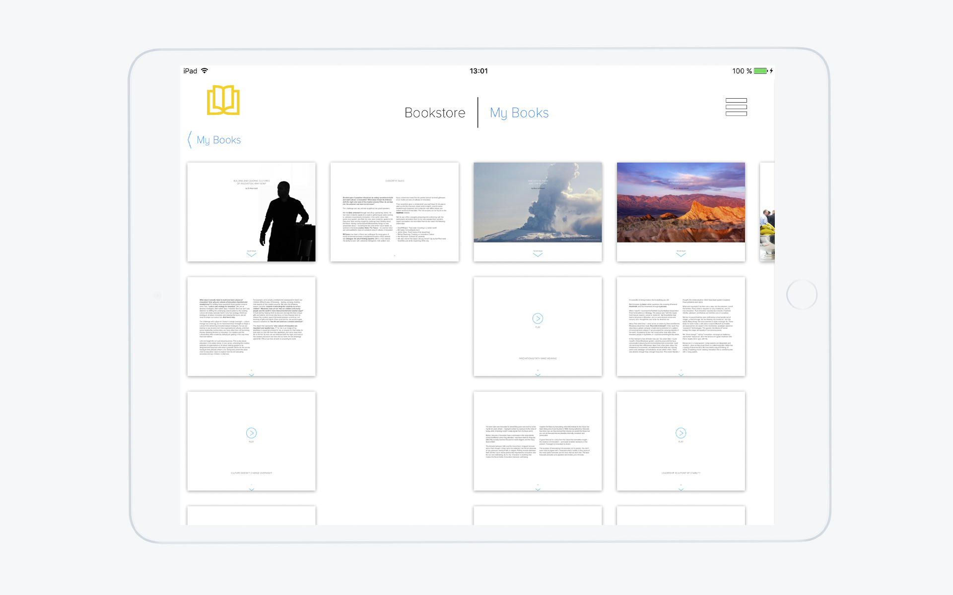
The digital form provided new opportunities for Nowhere to enhance the format of their books by changing the structure of books from one-dimensional (turning pages left or right) to two-dimensional, as well as embedding video files right into the pages of the brochures. This unique format raised multiple developments challenges:

Book viewer
The book viewer was the biggest technical challenge of the whole app and went through 3 major iterations during development, with countless performance tweaks and user interaction enhancements. We ended up using the stock CollectionView element from Apple and heavily customising it. Using the modified stock UI elements helps us future-proof the application and expect less app maintenance.
2-dimensional Book Formatting
Nowhere provided the books as a PDF file, so we wrote a script that extracted separate pages and created a file that mapped each page to its position and defined any special features of the page (like an embedded video).
Pixel-perfect UI
The UI ended up being pixel-perfect in the strict definition of the word. A huge help was Nowhere having a clear vision of their final product and providing their designs in Sketch, as well as giving their feedback on every available build. Our method of choice for checking the state of the UI is making a semi-transparent screenshot of the app, then putting it on top of the the design view for the same screen. It may take some time to check all the screens, but it gives us confidence to call our implementation "pixel-perfect".
Nowhere made it clear that the quality of the product is most important here, and some things are subject to change after they can actually try it out on a real device. To suit their needs we set up a build distribution system to make sure the latest app version was always available and had frequent discussions about the current state of the project and their wishes and concerns.
We still employ this way of communication for our current projects to keep the development process transparent and ensure fast reactions to customer requests.
«After receiving the assignment and asking relevant questions, Exyte executed excellently in matching the design plans, creating properly-functioning products, communicating effectively, and being available for ongoing consultation.»
Read more on Clutch