
Nowhere has been around since the 1990s, and since their creation, the company has been helping their clients to develop corporate culture. They achieve this by making improvements to communication within companies, as well as creating conditions that are conducive to a productive and creative working environment. Over the company's years in business, Nowhere has published several brochures and books that have help to build company procedures and to fine-tune those that are already in place.
When Nowhere approached us, they had an idea to create an iOS app that featured educational content that could be used when they were working with their clients. Using an app as the medium for delivering this type of content works better than having the same material in a printed format.
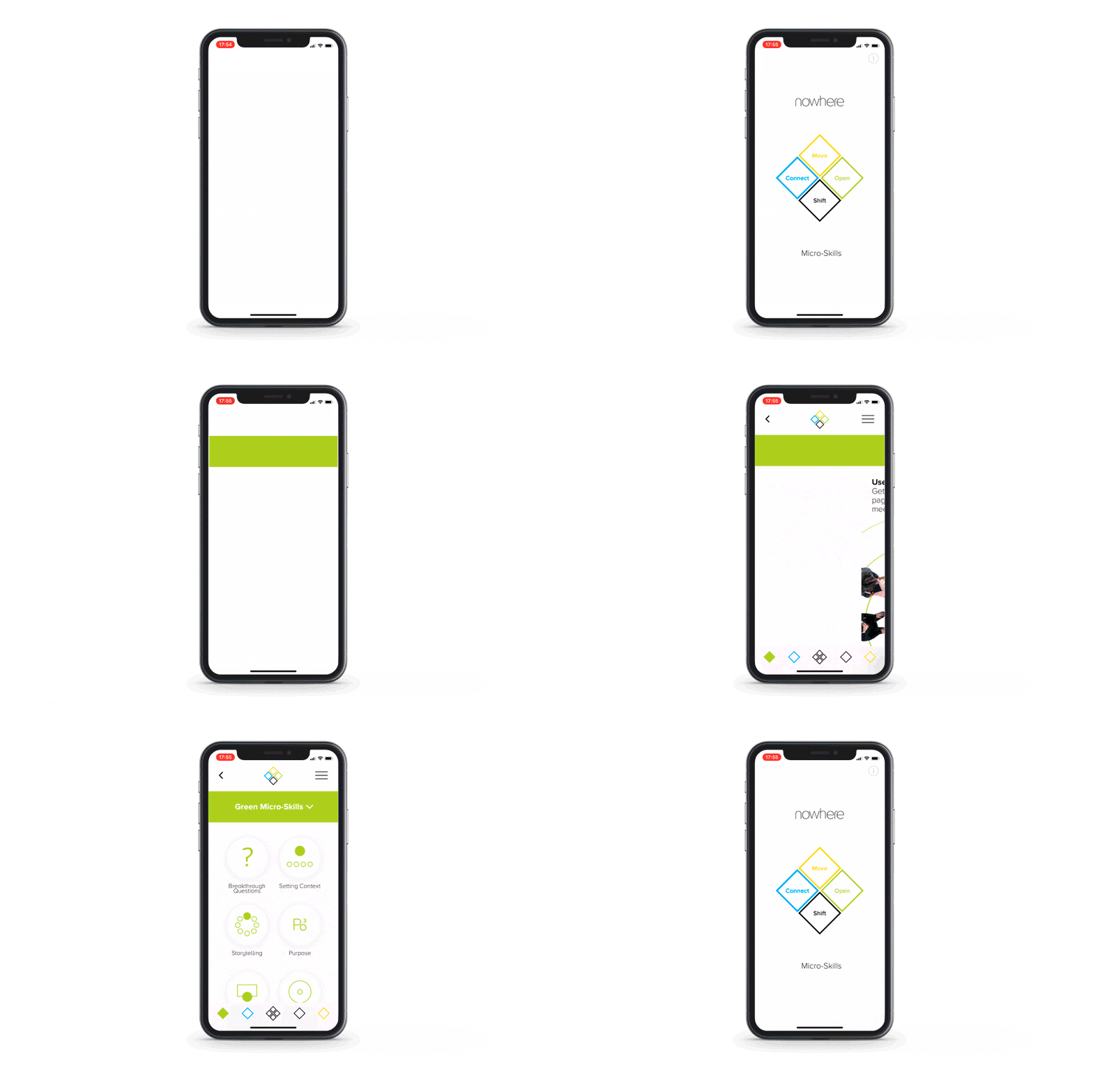
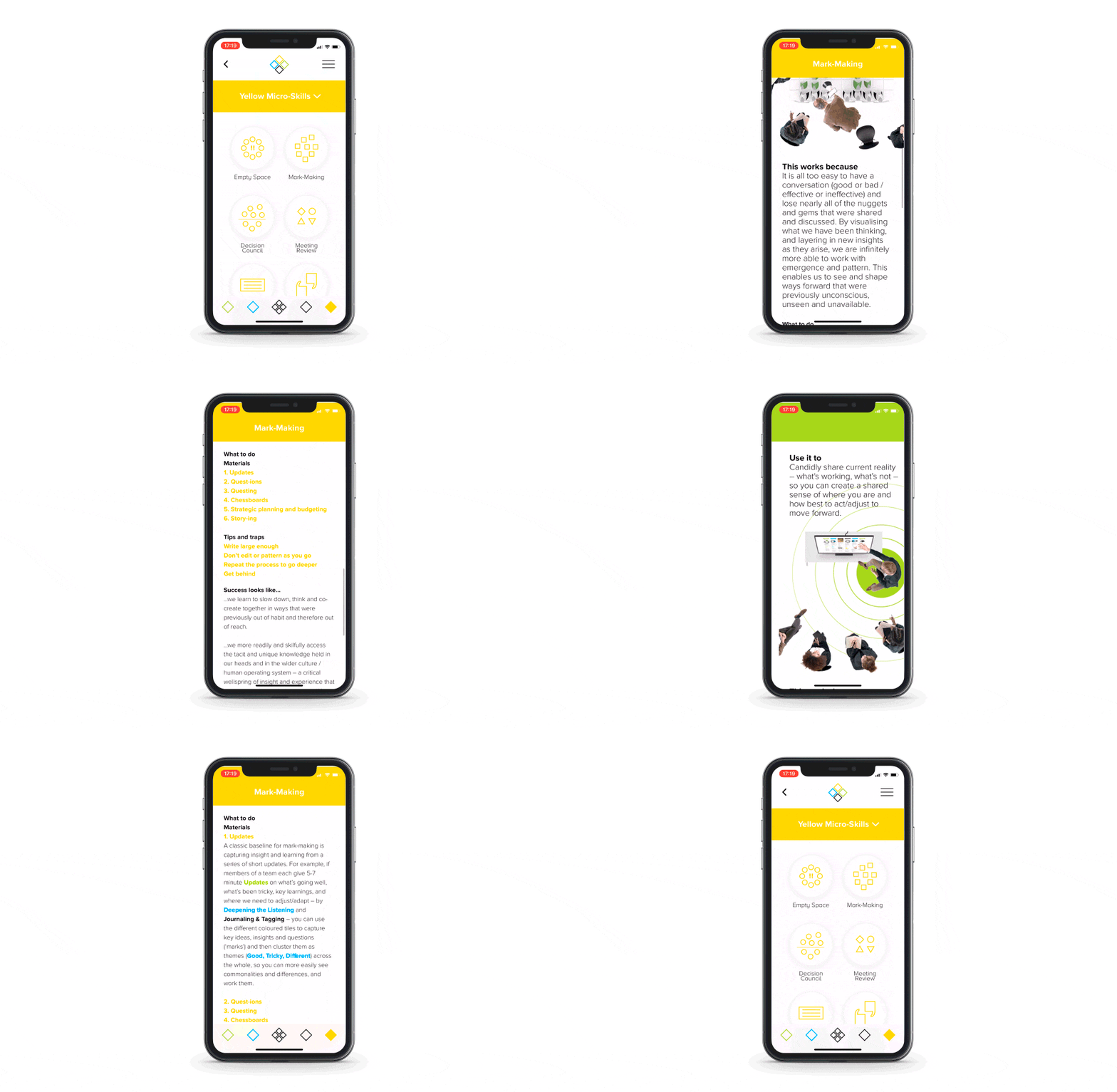
The app created was a book of four chapters. It was made easier to navigate with the additions of subchapters and hyperlinks. The users can quickly and easily find what they are looking for when they are reading through the content.

It was about more than just creating the app. It was also essential to make sure that the clean, minimal design of Nowhere was reflected in the look and feel of the application.
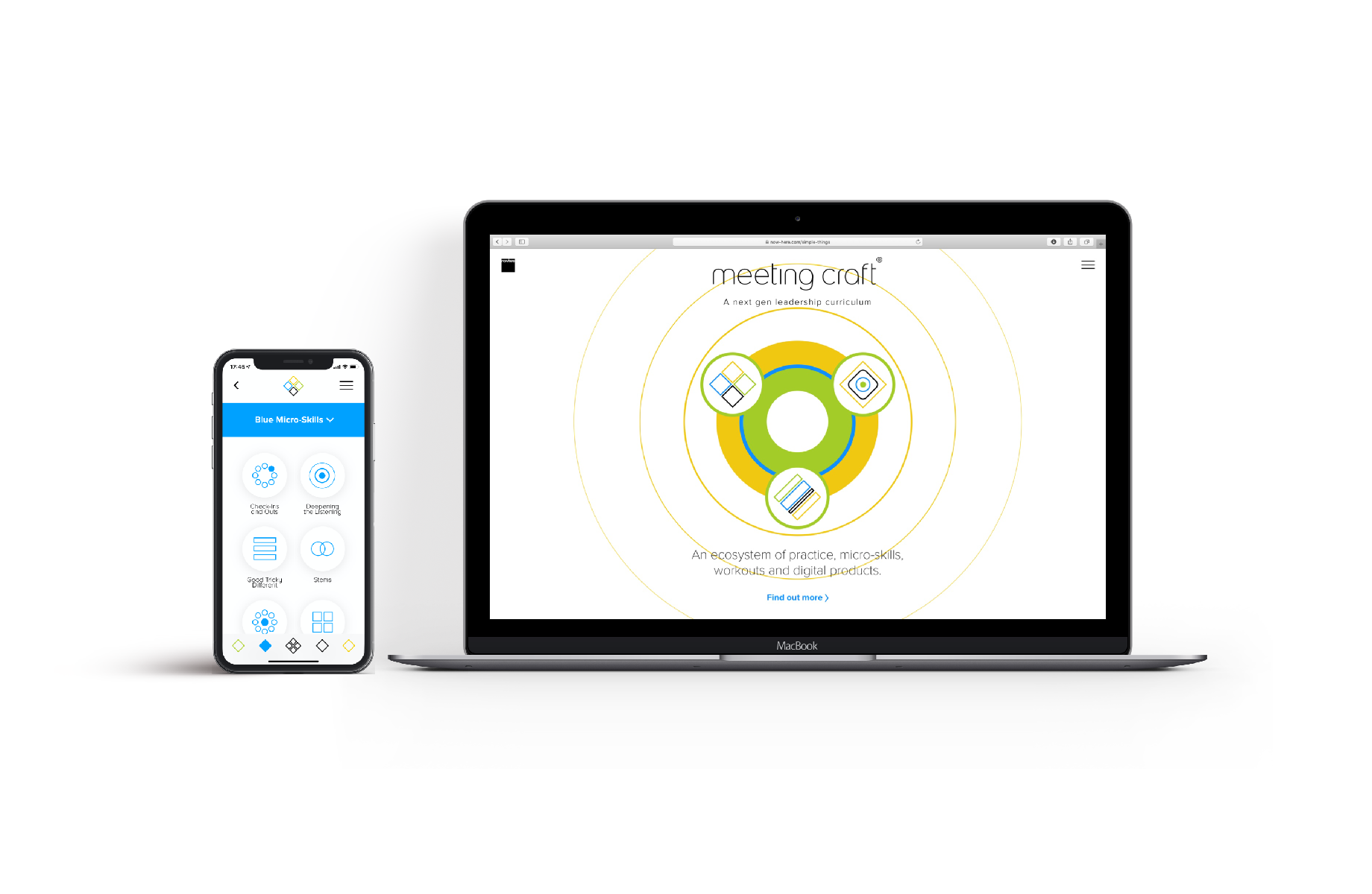
The app was design-ready when it was presented, and Nowhere wanted to make sure that there was a seamless experience between their digital media, their website, and the new app. This meant creating custom UI elements.
Although the design is minimal, we needed to be able to make the app work seamlessly and smoothly for the end-user. We wanted to make sure that the user could tell that they were using a well-made app that was meant to help them.
The main task was to make sure that all of the elements of the app, including the animation timings, the transitions between scenes, and the tuning, allowed the app to run smoothly.

Although iOS has default controls that work well enough, they tend to have limited customization options. This makes it challenging to make the app your own.
Transitions between chapter and content views, for example, would require several customizations including:

The term Pixel Perfect UI refers to frontend development that creates an app that looks exactly like the design when it appears on a phone screen. The technical aspect and manual manipulation of text wrapping and rendering can cause problems.
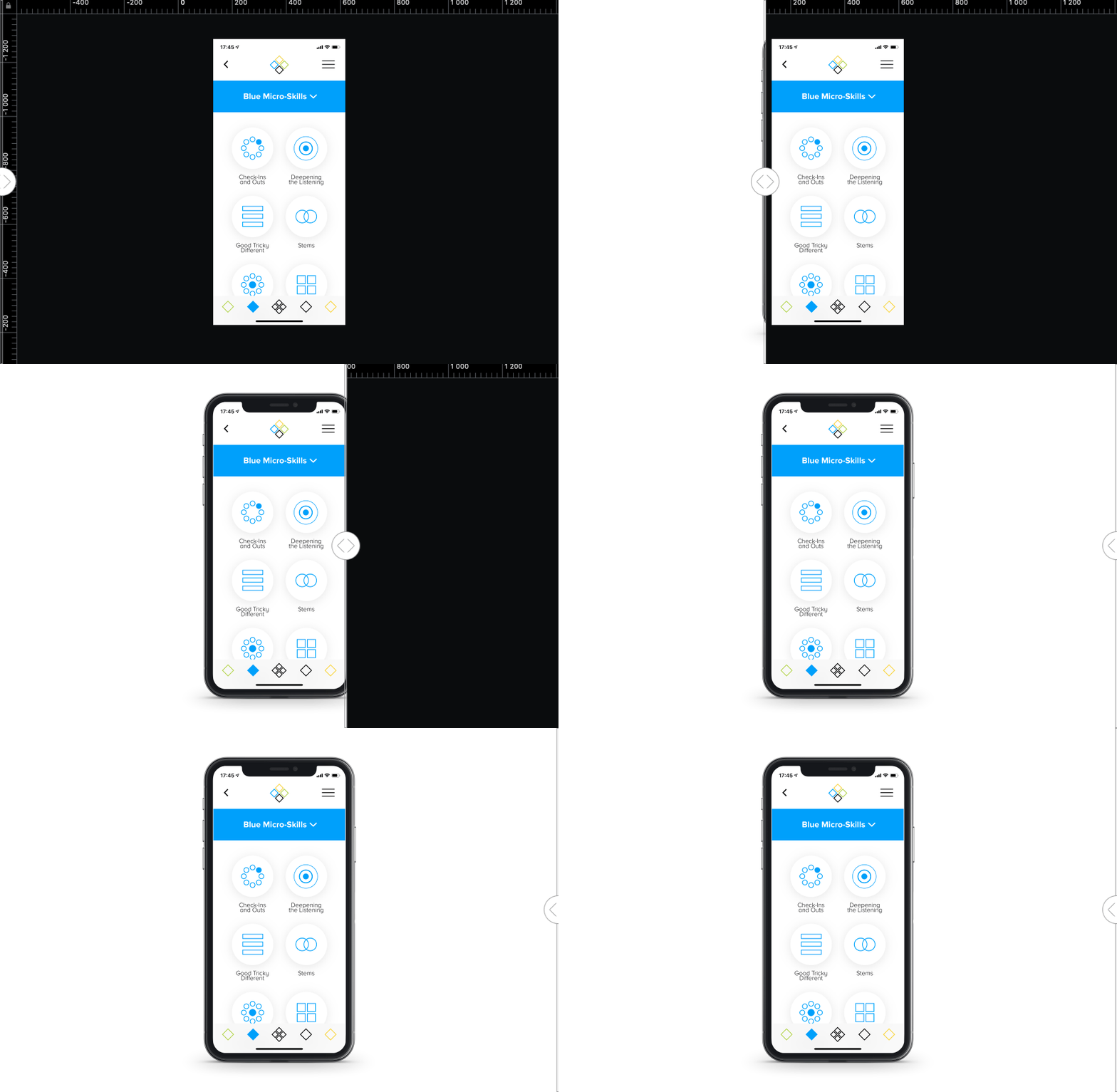
The method that we use when checking the UI state is to make a semi-transparent screenshot of the app and then put it on top of the design view of the same screen. Although this takes some time, the results are phenomenal. It allowed us to call our implementation pixel perfect.

At the start of the project, the team featured a UI designer from Nowhere, along with frontend developers from Exyte. We utilized communication channels through Slack for chat and Zenhub for task management. Also, we set the time of the weekly calls for sprints and daily scrums in Slack with Nowhere's PM and QA engineer.
Because the team was communicating regularly through Slack, if there were issues or changes to the design, our frontend team was able to address them right away.
The application is now released to App Store and used by nowhere in their work.
Communication:
- ZenHub
- Slack
Development:
- Swift
- Macaw library
«We have three criteria for determining quality work. The first is that the product functions perfectly. The second is that it matches the designs exactly. The third is the quality of their communication and availability. I think in all three areas they're really good.»
Read more on Clutch