 BACK TO ALL

It is an interview about an open-source development and SwiftUI, answered by a CTO of an app development firm, conducted by our marketing team. The story may be interesting for those who work with SwiftUI or develop their open source project.
When you develop an open source projects, you can move as fast as you want, experiment, and try new interesting, innovative approaches. Years later, technology giants will skim the best of approaches tried by open source community and offer their implementation, which will be much more solid and stable.
The goal of open source projects is to form new directions, and then die under the onslaught of more thorough solutions from the giants of the market. We can only adapt and move on, trying something new and thought-provoking.
When and why did you decide to start an open-source project?
In 2015 we started working with the iOS market. At that time, we already had a solid background in Desktop/Web technologies and experience with modern graphics libraries like JavaFX/WPF/Qt/etc. How surprised we were when find there was no good framework to work with vector graphics in iOS, and as a consequence, there was no good SVG support. So we decided to create an open-source framework to fill this gap.
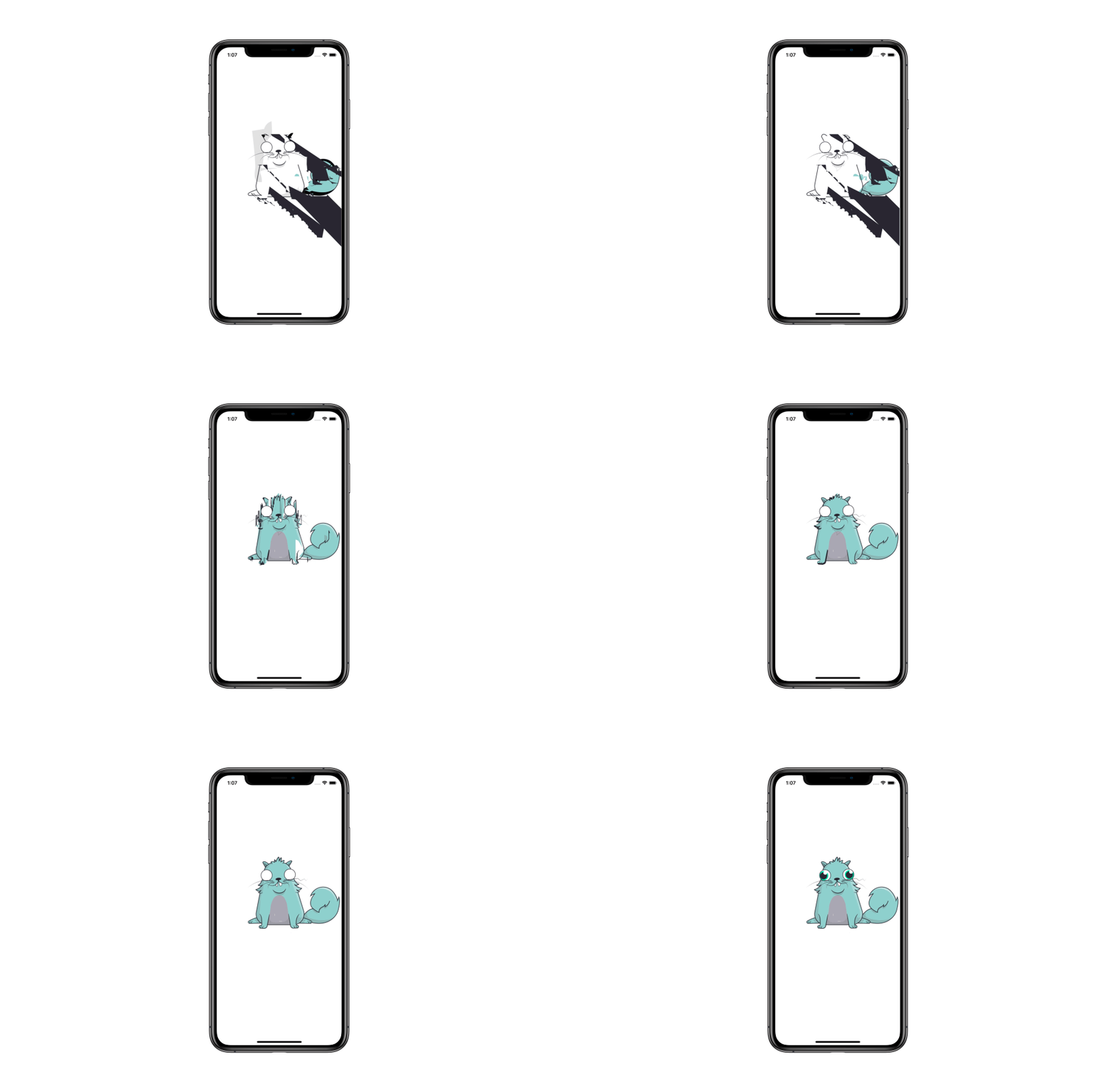
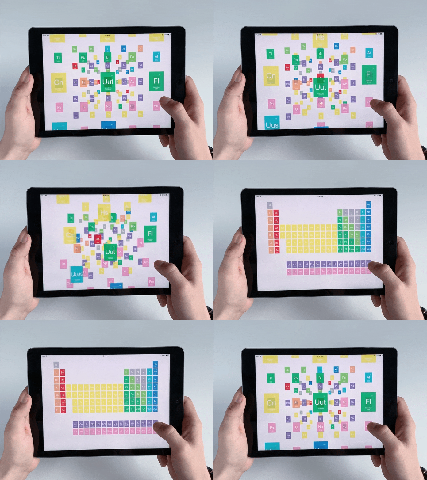
I called the project Macaw. It started in 2015 as a framework for an easy and convenient UI construction. Now Macaw can work with vector graphics, animation, declarative API, and SVG support. If you need to make a beautiful chart or custom control, the easiest way to do it is with Macaw.
.gif)
You have been developing your graphics library for four years when Apple announced its solution to graphics in iOS, right?
Yes, Macaw used to be a popular open source library for vector graphics and UI with almost 5K stars on GitHub, but that was before SwiftUI was released. I watched WWDC’19 live, and as soon as SwiftUI was announced, I dashed to my laptop to check how much it overlaps with Macaw.
Quite soon I found out that SwiftUI covered 90% of Macaw’s features. I spent the next few days studying SwiftUI, scrutinizing the documentation, investigating the framework and trying to understand how good it was.
I felt bitter seeing Macaw go obsolete in just one night after we worked on it for years. But on the other hand, we did a free open source project as we pleased and when we wanted, and Apple probably spent tons of resources on SwiftUI. Surely, Apple's framework is a huge step forward compared to what Macaw was.
What is SwiftUI, and why you think Apple created it?
SwiftUI is a great framework for building a user interface. It is built on modern principles: declarative syntax, simple and convenient API, WYSIWYG editor, etc. It also includes work with vector graphics, scene graphs, animations, and all that we had in Macaw.
Except maybe for SVG, Macaw still beats SwiftUI in terms of parsing SVG images, maybe it is due to the fact that Apple isn’t trying to make an SVG-parser. Yet.

So you thought about SwiftUI's functionality four years before it was implemented by Apple?
In fact, the idea of such a universal and convenient framework for building user interfaces was already there when I got interested in UI development back in 2008. That was the age of WPF and JavaFX, when tools for UI building only appeared for Desktop (on .NET and Java platforms, respectively). Even then, I remember having an idle minute with a cup of tea looking at these libraries and thinking that a fair number of things could have been done better.
I first tried my hand at writing a graphics library in 2014 when we [at Exyte] were making a library for Java called Sweet. In 2016, Sweet was in a way more similar to SwiftUI - there was not only vector graphics, but also widgets, layout, bindings, live editing, etc. One-year-old Macaw then had nothing but plans of having those features.
Being a huge step forward, will SwiftUI replace UIKit/AppKit/WatchKit?
SwiftUI is a full-fledged graphics library and it will replace the rest of the UI libraries on Apple platforms at some point. I think in a couple of years, we all will use SwiftUI for most projects, but earlier frameworks won’t just disappear all of a sudden.
The iOS community has already witnessed a similar situation with Objective-C. Swift has been released in 2014 , yet there are many applications that still run on Objective-C, and the transition hasn't been completed yet.
If UIKit is here to stay for at least a few years, can we use SwiftUI and UIKit simultaneously?
Yes, you can use views from SwiftUI in UIKit and vice versa, which is an important step in the transition from UIKit to SwiftUI. What it means is that you don't have to rewrite the application from scratch to use SwiftUI features, you can just describe all the new components in the interface on SwiftUI and integrate them into your UIKit-based application.
For example:
Can you use Auto Layout in SwiftUI ?
No, you cannot. Although some parts of SwiftUI do use Auto Layout deep under the hood, but developers have no access to it.
I must say that while other mobile platforms have also begun to adopt Auto Layout, only iOS had this constraint-based approach as the main one. Leaving Auto Layout behind was a logical step in the transition from storyboards to declarative UI, because writing constraints in the code would be too time-consuming.
But at the same time, I believe that Apple's current approach with stacks is also just an intermediate stage. I find it much more convenient to work with layouts when they are separate from the main UI, using something similar to CSS, for example, where widgets only define the hierarchy. I believe Apple will come to that later.
Nevertheless Apple tried to provide an exhaustive documentation, there are still some questions. For example, what is "some" keyword and how the syntax inside {} braces works.
Oh, this is an interesting story; Apple has done a really good job here. You see, the goal of SwiftUI's declarative UI is to simplify and shorten the code as much as possible.
Remember how UIKit is used and how hard it is to read? Many graphics library developers resort to developing their own DSLs to avoid that. For example, react has JSX to avoid describing UI in pure JavaScript. But I think this approach is quite controversial too since using more than one language per project is bad practice and really complicates things.
Apple solved that problem by integrating declarativity right into Swift. some keyword allows you to use generics inside the View without taking them outside when you need just to reference the View. By the way, we did not use any generics in Macaw; otherwise, no declarative syntax would have worked.
For example, in Macaw if you want to create a container with some content, you write:
Specifically to simplify this syntax we added extension group():
Swift has Function Builders for this so that you can use the traditional declarative syntax:
It is as simple and readable as possible.
The same goes for State variables (or bindings). They work so transparently that you don't even think about listening to model changes and updating the UI because SwiftUI does everything for you.
One of Macaw's key features was animation. How are things with animation in SwiftUI?

In Macaw, the animation was easy and convenient if compared to animations in UIKit. In SwiftUI, it is even easier thanks to the variables built into Swift state.
It is a great improvement compared to UIKit, where the animation was very complex, you had to bother with layers, think about a bunch of unnecessary details, etc. while you should have been able to build animation by simply changing the model indicating how to get to the final value (optionally setting time, easing, etc.).

Is there anything that Macaw can do, but SwiftUI can't?
There are two main reasons to use Macaw instead of SwiftUI right now. First, Macaw works for all versions of iOS and macOS. Second, it has an SVG parser that is unlikely to appear in SwiftUI as it is a whole different story. There are also some minor features, but I doubt we have to wait long before SwiftUI covers them too.
What difficulties can arise in mastering and using SwiftUI, based on the experience of developing Macaw?
The second difficult task (after actually creating the library) was explaining to the community how to use it, because Macaw approaches interface design in a way that is different from UIKit and similar libraries. In that way, SwiftUI is very similar to Macaw.
I respect and admire Apple here for immediately presenting a huge number of tutorials and documentation that explain their new approach to UI design. The community is also actively involved in highlighting all the features of the new framework. So I think SwiftUI would escape the problems Macaw had.
What will become of Macaw?
Macaw has a lot of users, and until SwiftUI works on 99% of phones, we'll keep supporting it. Again, we still have the best SVG parser in iOS. But I think as soon as SwiftUI covers all of Macaw's functionality, we will transfer SVG parser to SwiftUI and simply port Macaw to new versions of Swift.
About the author
Yuri Strot, CTO, Exyte. I have been professionally engaged in IT for more than 15 years. Before Exyte, I worked for several companies including Instantiations and API.AI which were acquired by Google.
I have experience in many different areas, such as backend, blockchain, AR / VR. But what I spend the most time on for the past four years has been Swift and iOS. Apart from developing the iOS app as a part of the business, I am also an open-source evangelist and take part in a few projects on Swift.


