 BACK TO ALL

When developing the UI of an app, we most often deal with a 2D layout of visual elements.
There are many models designed to standardize and simplify layouts. For web development, CSS Working Group proposed Grid Layout in 2017 as the best way to create 2D UI templates.
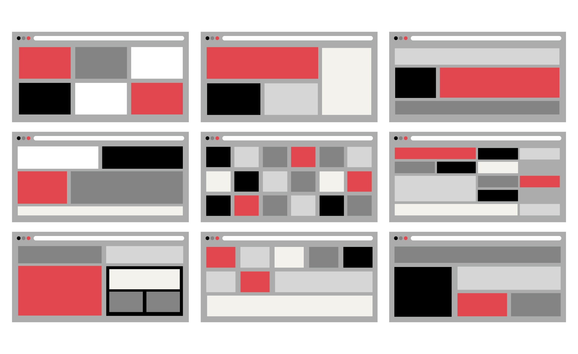
Swift has been late on adding something similar to Grid Layout. In iOS 13 SDK, Apple added the possibility to arrange elements linearly through VStack, HStack, and ZStack in the form of a list. But creating 2D interfaces in such a way is unwieldy since it is inconvenient to arrange the elements in a two-dimensional coordinate system.
Recently, both Exyte and Apple worked on and released our own grid implementations, but our final results are quite different. In this article, we will look at what Grid Layout is, what features it has, and how our grid implementation differs from Apple’s.
What is Grid Layout?
Here’s an example of a simple grid:

Essentially, a grid consists of rows and columns, organized in tracks.
Each of the tracks is of a certain size, which can be either:
- a fixed number of points.
- a certain fraction of free space.
- an adaptive size that depends on the size of internal elements.
Here, all the grid items are of one size. If we wanted, we could make them different sizes — some could span multiple columns and rows, others would remain in their cell.
Examples of Grid Layout
The most obvious example of a grid is a collection of cells. Whether they are on a horizontal or vertical axis, with merged or single cells — it doesn’t matter.
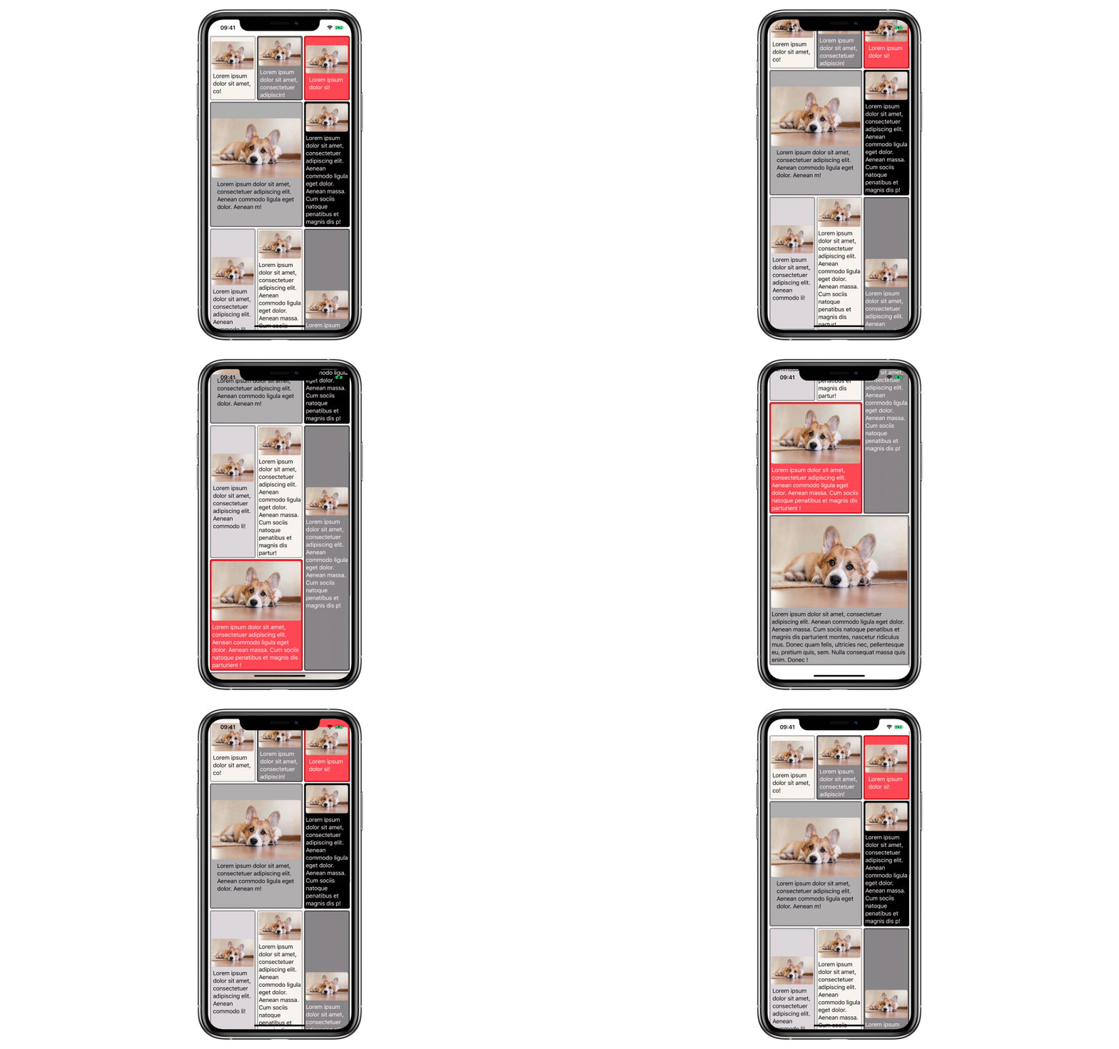
Grid, unlike UICollectionView, works with row- and column-level semantics.
Here are a few applications where Grid Layout greatly helps with UI:
Timetable
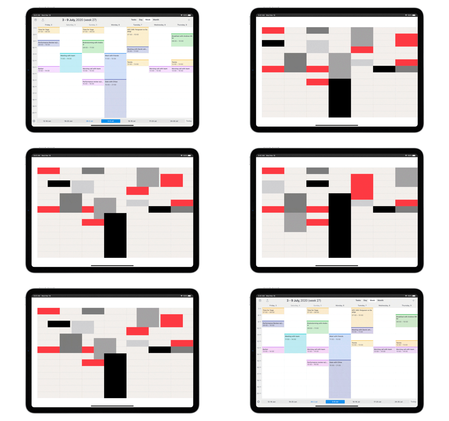
In this example, we display a daily schedule in the form of a grid with cells representing various events, with their span proportional to the duration of the event.
Additionally, we can see how a change in the duration and start date of some events changes the timetable.
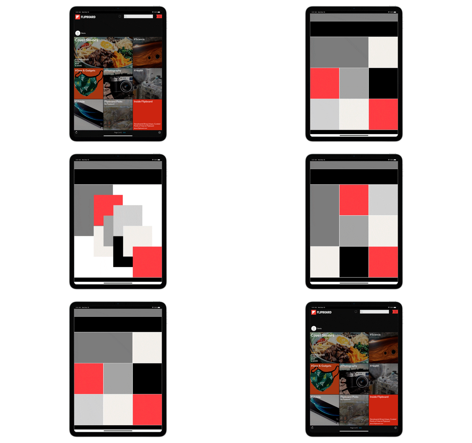
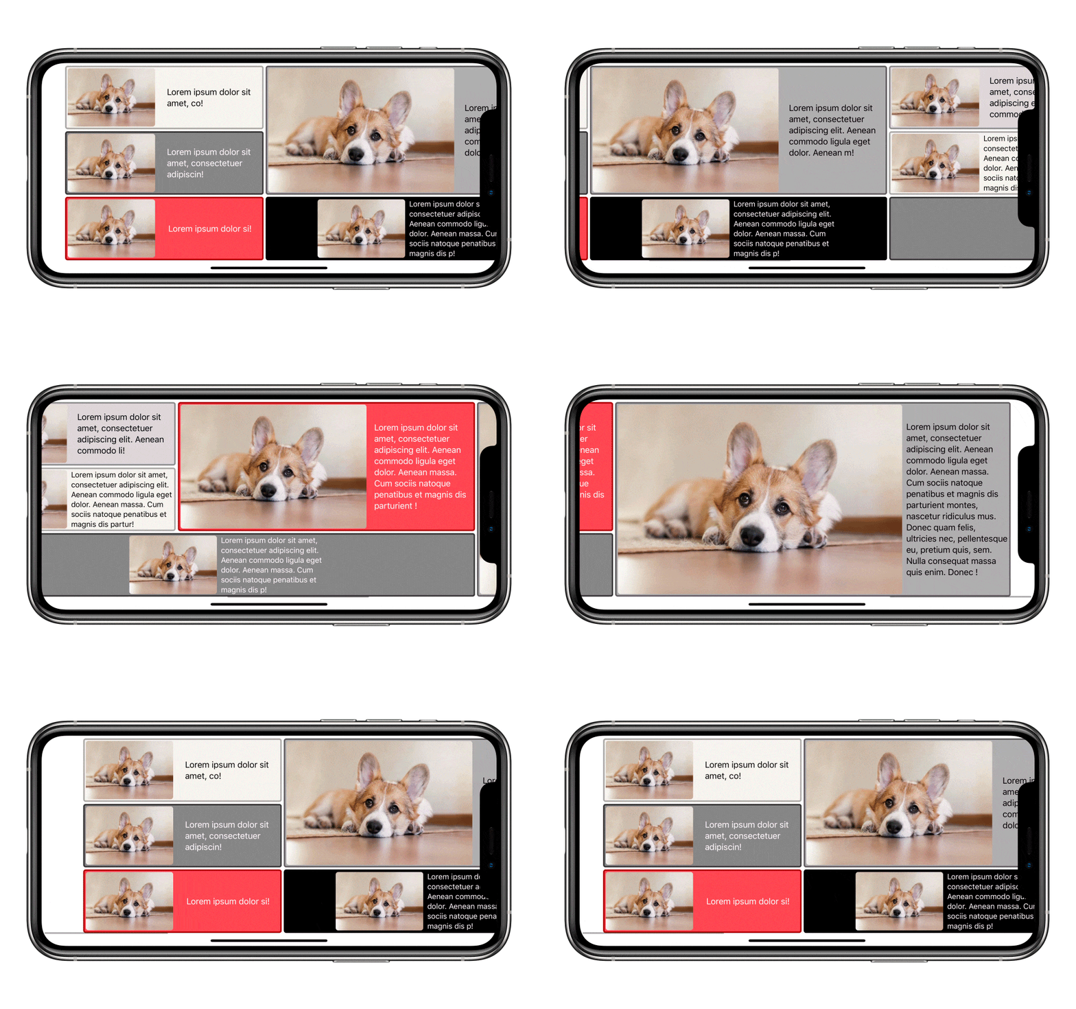
Flipboard is a news application where each news item is represented by a cell that contains a picture, headline, and a short description. The size of the cell can signify the priority of the news, and their position can be linked to their recency.
Grid Layout is well-suited for rearranging the order of the news on the fly. For example, in the picture above, we change the grid flow from .rows to .columns.
Grid Layout implementation requirements
In addition to basic grid functionality, Grid Layout must implement several other features which are very useful for developers:
- One of the key features of the grid is the ability to merge rows and columns. We should be able to merge them even when the semantics of sizing are different.
- For each element, we need to be able to explicitly specify a column, row, or both at once as its location. The rest of the elements should be positioned automatically.
- It should also be possible to set the direction of the tracks (along which axis the elements will be located: along rows or along columns).
- In some situations, the next element cannot fit in the current free position and is transferred to the next track. In this case, we have an empty space even if some of the following elements would be able to fill in this space. To solve this, we need to have access to a dense packing algorithm.
- A grid can contain elements that need either to fit within the parent container or become scrollable to fit the parent container. To solve that, we need the scroll and fill modes.
- The spacing between the elements must be adjustable.
- And, of course, we should be able to add animations for all the changes that happen.
Our grid implementation
We have implemented all the requirements above in ExyteGrid — our own grid implementation that is written entirely in SwiftUI.
Here are a few examples where ExyteGrid could be used to implement application UIs:
Strava
The interface of this application’s screen is nothing more than a grid (which we have represented by colored rectangles). We’ve also implemented an alternative landscape view by changing the number of columns, starting positions, and spans of some of the elements.
iOS calculator
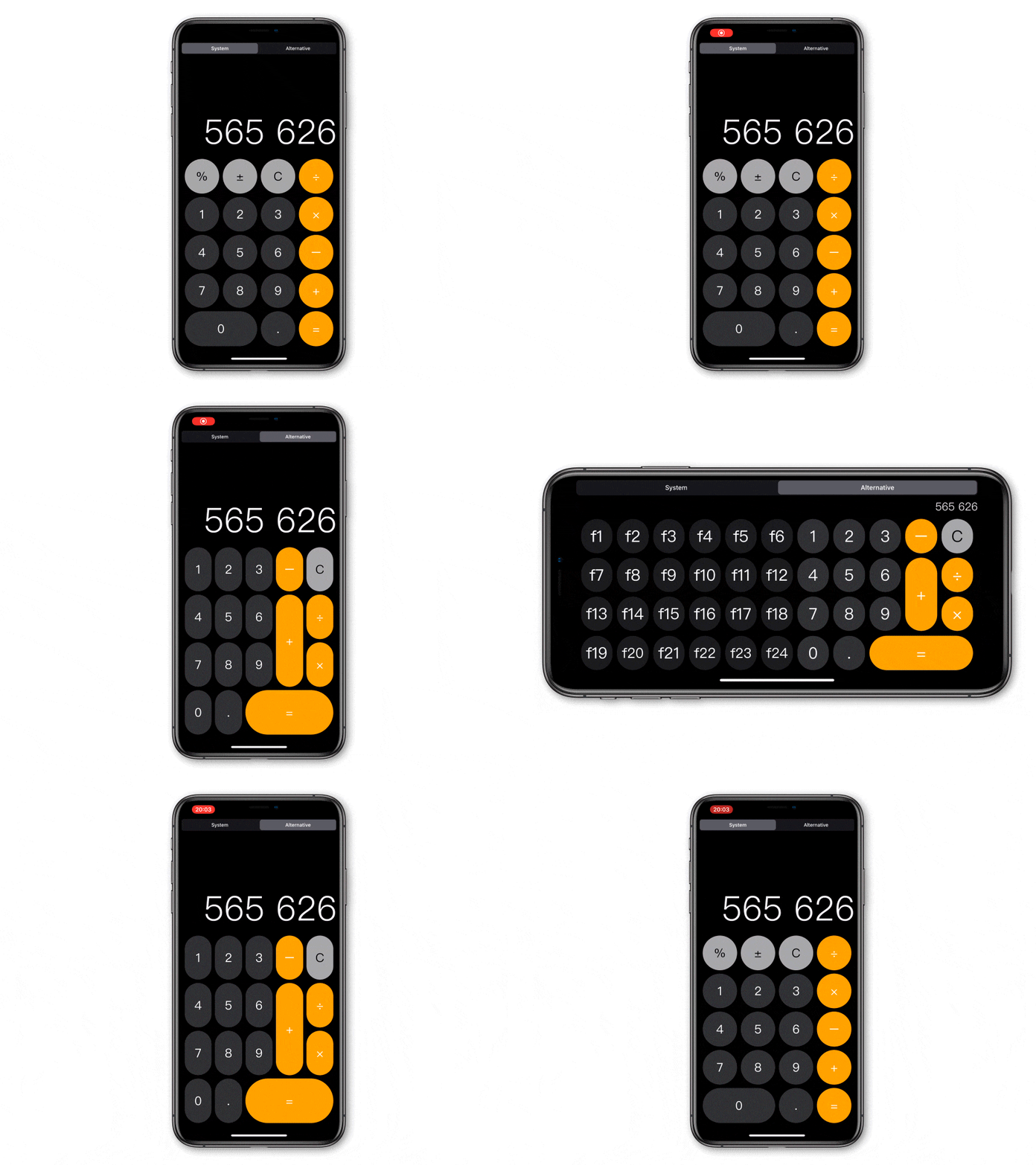
Do you remember the built-in iOS calculator? As you might have guessed, it also is a grid, with each button representing one grid item. Using ExyteGrid, we not only replicated the layout, but also easily implemented an alternative view in a similar way. Thanks to the power of SwiftUI, we can animate grid state changes.
Differences between ExyteGrid and Apple’s Lazy Grid
If we talk about the recently announced Apple LazyVGrid and LazyHGrid, there are several differences between them and ExyteGrid:
- Apple’s implementation lacks the ability to specify the cell span. This means that cells can’t be combined vertically and/or horizontally with multiple adjacent cells.
- It is also impossible to specify a priority position for elements: a fixed column or a row you would like the item to reside in.
- Existence of these two possibilities in ExyteGrid enables us to provide two modes of packing elements: sparse (the usual one) and dense (the order of elements can be changed to minimize the number of empty spaces).
- Changes in the Apple Grid’s state most often result in the usual fade animation if the elements are not in a single ForEach. ExyteGrid does animation by associating the item’s ID with its position within the grid. In this case, individual elements can be assigned a specific ID using a GridGroup or ForEach, which allows SwiftUI to assign a transition animation to each element.
- Flex tracks are sized differently. Flexible size in Apple Grid requires an explicit specification of max size in points, while .fr (fractional units) in ExyteGrid can specify the track sizes as ratios.
- There is a big difference between Apple Grid's .adaptive sizing and .fit sizing of our implementation. Adaptive sizing does not really specify a specific number of tracks. It creates as many of them as it can in accordance with the restrictions. Fit sizing for ExyteGrid creates one track, the size of which is equal to the size of the maximum element that falls into it.
- In ExyteGrid, you can specify a gridCellOverlay and a gridCellBackground, which makes it possible to place a custom view in free space around items when it appears. (This happens when there is a difference in the size of items in the same row or column.)
- Apple Grid loads items lazily, while ExyteGrid initializes them all at once.
- ExyteGrid has content mode: .fill where the grid arranges items to fill the container view, without having to manually calculate the size of each item.
These two implementations are conceptually similar, but in many respects quite different. On the one hand, Apple Grid has a native implementation focused on a large number of elements, and on the other hand, ExyteGrid possesses more functionality and open source code, so anyone can participate in its improvement.
If you choose to use ExyteGrid, we would be glad to see you both as users and collaborators. Of course, there are still many features that have yet to be done. More on that in our roadmap.


