With 57% of all digital media usage coming from mobile apps, and 49% of people opening an app at least 11 times each day, ensuring a good user experience has never been more important. Today, users expect a lot from the apps they use, including ease of use and fast response times. Therefore, if you want an app to be successful, there are several good app design practices you need to consider. Below, we've listed the great design practices we think you should follow when designing apps in the future.
Navigation
Make your app intuitive
Users should be able to identify how to get around a mobile app immediately, and it needs to be more intuitive than a desktop site. You could have a myriad of cool features and top-quality content, but that doesn't mean anything if your users can't find them. Ask yourself whether a user will be able to use your app without any help or explanation. To achieve intuitive navigation, opt for recognizable design icons and patterns, like hamburger/hotdog menus and home buttons.

Use standard navigation patterns
When designing menus, bear in mind that app users don't have the time or patience to scroll down a long list of options, so organize your menu with as few choices as possible (as long as this doesn't impact usability). If you're designing an app for iOS or Android, it's often best to use standard navigation patterns (navigation drawer for Android and tab bar for iOS) as users are already familiar with them. Top tip: Don't use multiple patterns in one app either - if you choose tab bar for your homepage, use this across your entire app.

Take care when organizing the structure
Finally, make sure you prioritize navigation based on how users will interact with your app. The best way to do this is to determine which pages and features people will visit the most and then organize your structure so that it requires the fewest amount of clicks, taps, and screens. Take banking apps as an example; to check accounts or move and pay money, users will be required to log in, which is understandable. However, if users simply want to check where their closest branch or cash machine is, do they need to log in, or could this information be accessed via the home screen? Making basic functions simple to access is one of the best ways to improve user experience.
First impressions
Don't ask users to sign up straight away
Users should be able to explore before they commit, so avoid using sign-in walls, which require them to join up first. Although customer information is important for your business, this is one of the main reasons why people abandon apps, so don't ask for this too early on. Really, you should only be asking users to register if it's absolutely necessary, so if it is essential, allow them to take a tour of the app first. By giving users a taste of the experience, they're more likely to commit in the long-term.
Make onboarding easy
According to Localytics, 25% of users abandon apps after one use, which is why retaining them is so important. This is where onboarding comes in, which is the process of showing users how your app will add value to their lives. A great example of an app that does this well is Slack.
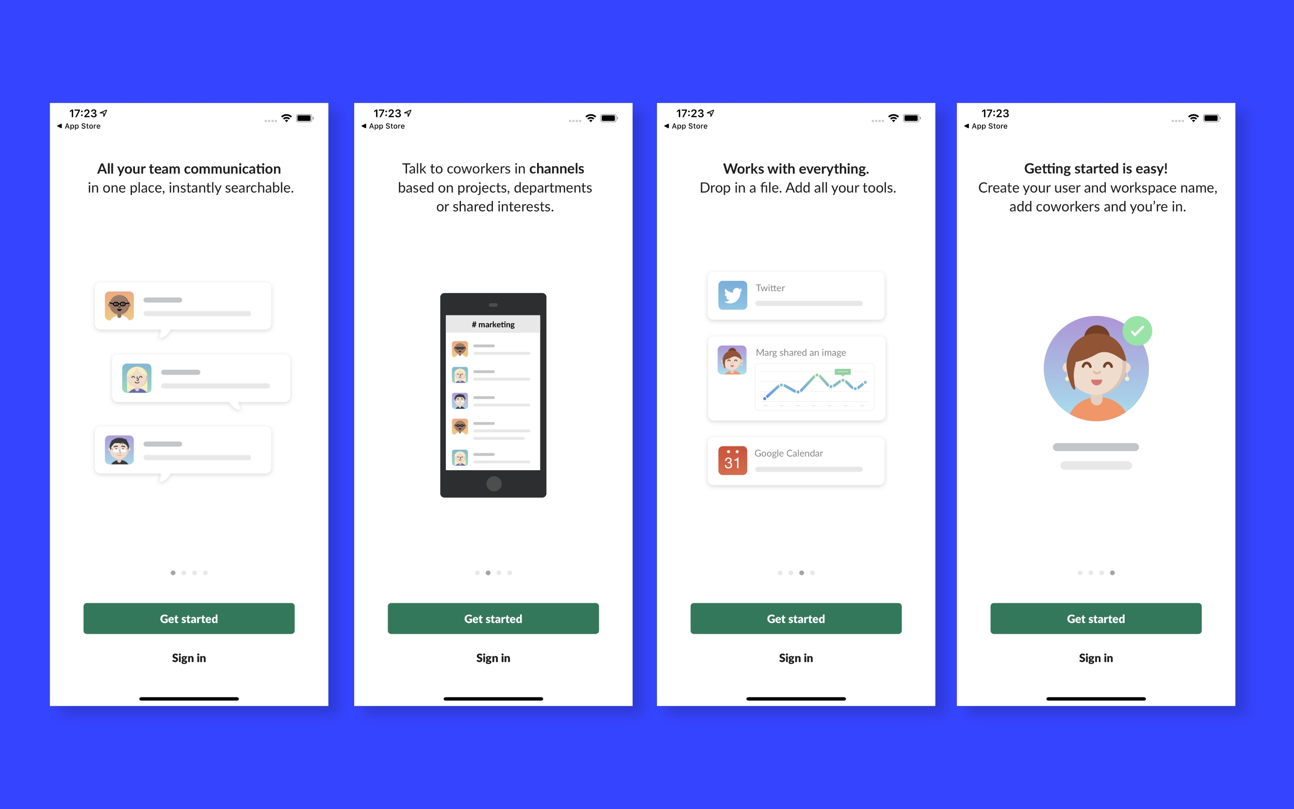
The four walk-through screens provide context about the app before revealing its benefits. This helps users to quickly visualize how they can share and communicate with their teams in just one space. Although it does require users to either sign in or create an account, it makes this easy by offering users the option to sign in using a magic link.
Speed and responsiveness
Make your app appear fast. 48% of customers uninstall or stop using an app if it's slow, which is why speed should be a priority during the design and build stage. However, no matter how fast you can make an app, certain things will take more time to process, and slow internet connections can impact response times too. This is why you need to make waiting for a page to load less frustrating by ensuring at least some content appears when the page opens, also known as placeholder text. Make sure it's enough content to fill the screen and keep users engaged while the rest of the content loads in the background.
Let them know when something is loading
A blank screen during loading only results in frustration and confusion for users, so make sure it's clear that something is actually happening. If you don't, users will most likely believe the app has crashed and leave. A spinner is probably the feature most commonly used to indicate a page is loading, but you might consider using an interesting custom animation. Another approach you can consider is only blocking the part of the UI that is waiting for the update, while keeping everything else accessible. It's worth remembering that trying to cram everything from a desktop UI onto a mobile screen will make your app look cramped and could cause it to run slowly. Focus on eliminating any elements that aren't necessary for users to do what they need to - this will create a more user-friendly and streamlined UI.

Personalization
Personalization is key to improving user experience on an app, and it allows you to provide information and connect with users in a genuine way. There are countless ways to incorporate personalization, but no matter what you choose, it needs to guide users to content that is relevant to them. For example, you could use past searches and purchases to offer deals on products they like or use their location to notify them of what's available in their area. Beware that too much personalization can have the opposite effect, especially if your app displays ads for a product they have been thinking about but haven't searched for yet.
When it comes to personalization, nobody does it better than Spotify. It leverages a user's listening data to create playlists and features they will enjoy, such as "Discover Weekly", "Daily Mixes" and "Spotify Wrapped".

Push notifications
Push notifications are excellent marketing tools when used correctly, allowing you to stay in contact with your users. However, if you use this method too often, they may mute them, which has the complete opposite effect than you were hoping for. There's no right or wrong strategy when it comes to determining how many push notifications you should send; approximately 52 percent of mobile users surveyed said they found push notifications to be annoying, but the remaining 48 percent found them to be useful. As such, the best way to approach this is to be selective and ask yourself whether the message will add value to the user.
As well as thinking about what you're going to say, carefully consider when you're going to send the notifications. Leanplum found that 63 percent of marketers send push notifications at the wrong time, so a good rule of thumb is to avoid sending them at night when people are most likely to be asleep. If they wake up in the morning to a stream of messages and notifications, yours could easily be ignored. As such, send notifications based on when mobile users are most engaged. This is usually between 7am - 10am and 6pm - 10pm.
Content design
Readability
The key to good app design is ensuring all text is legible and readable. After all, if users can't read what you're offering, what's the point in offering it at all? A good approach is to ensure all text is at least 12 points, as anything smaller will be difficult to read. You should also think carefully about the font you use. Good options for apps include Helvetica, Open Sans, and Montserrat. However, the safest option is to use the standard typefaces on offer; this is Roboto for Android and San Francisco for iOS.
Images
Any images you use need to be in the right aspect ratio if you don't want them to look distorted. Both iOS and Android offer in-depth guidelines regarding app interfaces, including image resolution and architecture.
Conclusion
Ultimately, good design is all about striking the right balance between aesthetics and functionality. As a designer, you only have a matter of seconds to catch users' attention before they leave your app for one that's more intuitive and easy to use, so sticking to the best design practices we've listed above will be a step in the right direction if you want to make your app a success.
Great app design is now the norm, so users expect so much more from their apps than ever before. As such, it is important you put just as much time and thought into apps as any other format you work on. To find out more about what good app design practice is, contact us at Exyte today.